The following is a guest post written by Samantha Russell, Head of Marketing at Twenty Over Ten, one of our favorite website platforms for financial advisors.
We all know that first impressions matter. That’s why you won’t find advisors wearing their pajamas to a first meeting with a prospective client or having people meet them in an office that smells of garbage and is full of trash. We pay attention to the clothes we wear, how our office space looks, and all the other factors that impact first impressions because we know they matter.
Yet how many more people will visit your website and look you up online than will ever have the opportunity to meet you in person or see your office? Literally thousands more people per year are probably meeting you for the first time “virtually” by Googling you, visiting your website, and checking out your social media presences than will ever step foot in your office.
Yet most financial advisors spend incredible amounts of time, energy and resources on how they look, how they are dressed, and what their office looks like, and then completely ignore their website. For all intents and purposes, their website is out there in its pajamas. Advisors tend to have “update website” on a long list of items that never get done. Yet continuing to ignore this vital piece of your marketing will cost you business.
You have no way to measure how many people aren’t contacting you after visiting your website and not getting the vibe that you would be a good fit for them. But before the thought of just how much business you could be losing out on starts to overwhelm you, rest easy with the thought that it is within your control to fix the problem.
So, if you haven’t already, prioritize getting your website to a place where it perfectly encompasses what you would say to a prospective client in a first meeting. I advise our clients at Twenty Over Ten that they should focus on the three pages of advisor websites that usually get visited most often. These are, in order:
- Homepage,
- “About” (or Team, Bio, etc) page, and
- “Contact” page.
Today, let’s focus on your homepage, since that is the most important and most visited.
Homepages: How Much Time Do People Spend On Them?
The average person lands on a website and spends just 5.94 seconds on a homepage before clicking elsewhere – either continuing to peruse your site, or leaving. Thus, you have just 5 seconds to make a first impression. This is not much time at all – about the duration of a breath in and out – so it’s important to have a clear, concise message about who you are, what you do, and what type of clients you serve.
Another fact to note is that our brains process imagery 60,000x faster than text. Think about that. A picture really is worth a thousand words, so use imagery and graphics to your advantage.
The 5 Factors that Make Up a Great Advisory Firm Homepage:
1. A Clear and Clean Logo
A strong logo is the foundation of your entire brand. It is something that should be memorable, and help others immediately recognize your firm. If you do not have a strong logo, or if it’s blurry, or the colors or sizing are off, then this can really set the tone for your site before someone even dives into your website. You never want it to seem as though your logo was just plopped onto a templated website, which can easily be the case if the logo doesn’t fit and looks stretched or squished. It can quickly come off as unprofessional, which is not the feel any of us want for our business.
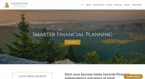
Golden Pine Advisory is a fee-only financial firm based in Pinehurst, North Carolina. They wanted a logo that used the pine tree, which is abundant in their area, to capture the essence of their advisory firm. It stands out against the white background with strong colors unique to the firm, making it a nice, identifiable mark.
2. Succinct Main Navigation
Studies show that a website’s navigation is among the first and most frequently viewed areas. Your visitors shouldn’t have to search too hard to find the information they are looking for. I advise no more than seven main pages total for any advisor website. All other pages can be grouped as “child” pages under those seven “parent” pages. Any more than seven, and the UX (user experience) can feel frustrating for those visiting your website and not knowing where to start. Don’t overwhelm people. I even suggest using a “Start Here” button to make it incredibly easy for those visiting your site to know exactly where to go next.
Keep in mind that good navigation isn’t just about having an easy-to-use menu bar that is consistent on all pages. Discovering how people use your website will help you create “paths” that can show important sales information on your product and services. Spend some time with Google Analytics, which will show you exactly how site visitors are engaging with your website, at least once per quarter. Based on the information you find, you’ll want to update certain areas of your website, make certain pages more prominent, change the wording of buttons, etc.
3. Intriguing Hero Image
Earlier, I explained that our brains process imagery 60,000x faster than text. Studies also show that visually appealing stimuli are an incredibly important part of getting people to stay on your site longer and, therefore, converting more visitors into customers. Your homepage image should also reinforce the copy.
So for instance, if you say you work with women, you’d want an engaging photo that represents women in some way. The homepage image on C.L. Sheldon & Company is a great example of how to do this well. Since their firm caters to active and retired military members, they’ve chosen an image of a child holding an American flag jumping joyfully into the arms of a military officer in uniform.
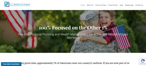
The picture reinforces the text and message that this firm caters to the military. Some very important things to keep in mind when choosing an image for your homepage:
- The image should reinforce the text
- It should capture the visitor’s attention
- High-resolution images will immediately pop and be regarded as more professional
If you don’t have a specific “niche” and aren’t sure what image would be best for your audience, then you might consider a backdrop of the city where you are located or real images of pictures of your own team (again, just make sure they are high quality). While royalty-free photos can be a useful tool, save them for your blogs and spring for professional photos on your homepage.
4. Include Who You Are, What you Do and Who You Serve Above the Fold
“Above the fold” is a marketing term for the portion of a page visitors see before scrolling at all. What you put above the fold should be the most important things you would want someone visiting your site to know about you during those initial five seconds. We always recommend that you clearly articulate who you are, what you do, and who you serve (and, if you can fit it, where you are located) right above the fold.
For example, if your firm caters to physicians in the Philadelphia area, you might say “Financial Planning, Debt Management and Strategic Investing for Physicians throughout Philadelphia.”

When a potential client lands on your homepage, you want them to be able to quickly “self-qualify” to immediately know they are on a website that specializes in helping people just like them.
5. Include a Clear and Strong Call to Action
In March of 2019, Twenty Over Ten (where I work) conducted a study of 206 firms, where we asked advisors a series of questions about their websites, the leads they were getting, and how many of those leads were turning into clients. Of those who answered that they were getting “6-10” or “11 or more” clients per year from their website and digital marketing, the number one thing they all had in common was this: they had an online calendar right on the homepage of their website, above the fold. It seems so simple, but having a clear, strong call to action (CTA) that tells site visitors exactly what you want them to do next is critically important (and it is the one step so many advisors forget when setting up their websites!).
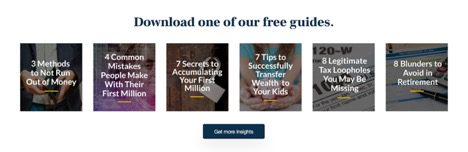
We can break CTAs into two groups: primary and secondary. Primary CTAs are the end goal that we all want: book a meeting or contact you. Of course, not everyone who visits a website will immediately be ready to take this action. So, we need to also have secondary CTAs that entice people who are still “just looking” to hand over their email address to us, so you can add them to your list and start nurturing them with drip campaigns. Carson Wealth’s homepage gives a great example of a secondary CTA, where they offer six of their most popular guides in exchange for name and email address.
Keep these six best practices in mind when trying to create a strong CTA:
- Be straightforward
- Show the user how they will benefit from giving up their contact information (what they will get)
- Be visually eye-catching to compel the visitor to take action
- Be placed in an easy to find location
- Use action-oriented verbs
- Be large enough without being distracting
Now that you know the 5 elements that add up to make a fantastic homepage, it’s time to get to work! Do an audit of your own site, looking at each of the five elements, and determine where your own site is lacking.
Remember, thousands more people per year are meeting you for the first time “virtually” by Googling you, visiting your website, and checking out your social media presences than will ever step foot in your office. So make your website a priority today!