
If you know me, you know I’ve gotten deep into golf over the past couple of years. Probably deeper than my handicap justifies. However, playing golf allowed something to click that I hadn’t expected to think about on a golf course related to the investment universe.
I spend my working hours looking at market data. Long histories, drawdowns, return distributions, the difference between what happens and what people expect to happen. And the thing that makes a golfer break 90 is roughly the same thing that makes an investor build wealth. It has nearly nothing to do with brilliance and almost everything to do with not compounding a manageable mistake into an unrecoverable one.
Good investing, like good golf, is less about hitting perfect shots and more about avoiding the decisions that turn small problems into big ones.
That idea connects to the reason why we built something this year that I think deserves more attention than it’s gotten. Alongside our Market Outlook 2026: Riding the Wave, Carson Investment Research put together the Principles of Investing Chartbook. It’s 20 charts covering the ideas that determine outcomes over a lifetime of investing.
Here are a few of the charts I keep coming back to, and what they have to do with a golf course.
The Round Is 18 Holes, Not One Swing
Nobody wins a round on the first tee. You can hit the best drive of your life on hole one and still shoot 105. It’s about what you do over the entire course, where little things add up over time. The same with investing, and it comes out with the power of compounding.
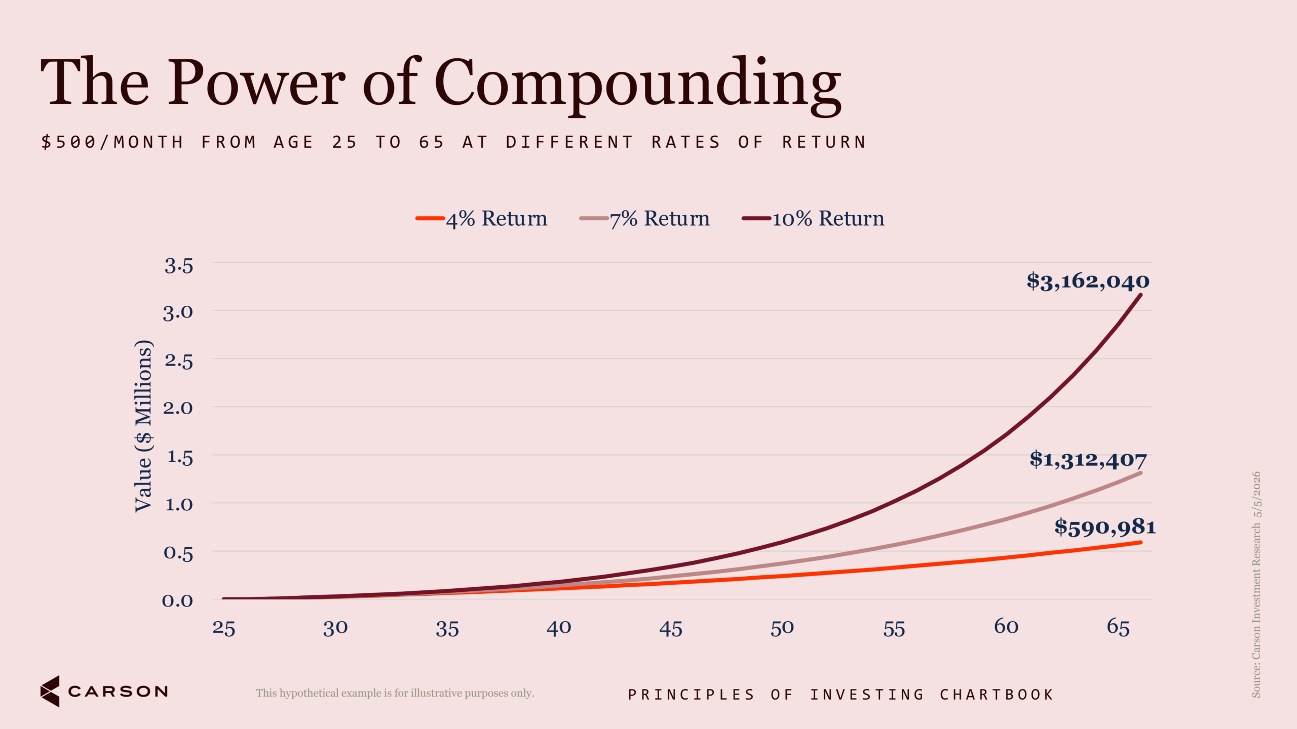
Here’s a hypothetical just to show the math. Three investors invest the same $500 a month. They continue to do it for the same 40 years. At 4%, you end up with roughly $591,000. At 7%, about $1.31 million. At 10%, about $3.16 million. We’re not saying you’ll get these returns, we’re just highlighting the difference.
Look at where those lines separate! For the first 15 years they sit almost on top of each other. Fifteen years of modest, boring progress doesn’t feel like it’s building toward anything, so people stop paying attention to the rate of return, or stop contributing altogether. The entire gap gets created on the back nine. Compounding does its best work long after most people have quit watching.
The Driver Isn’t the Right Club for Every Hole
Every golfer knows the guy who pulls out a driver on a 320-yard par 4 with water down the right side. Sometimes he’s a hero. More often he’s re-teeing. (haha, I’m talking about me…) In investing, you can choose to lay up, and sometimes it’s the right thing to do.
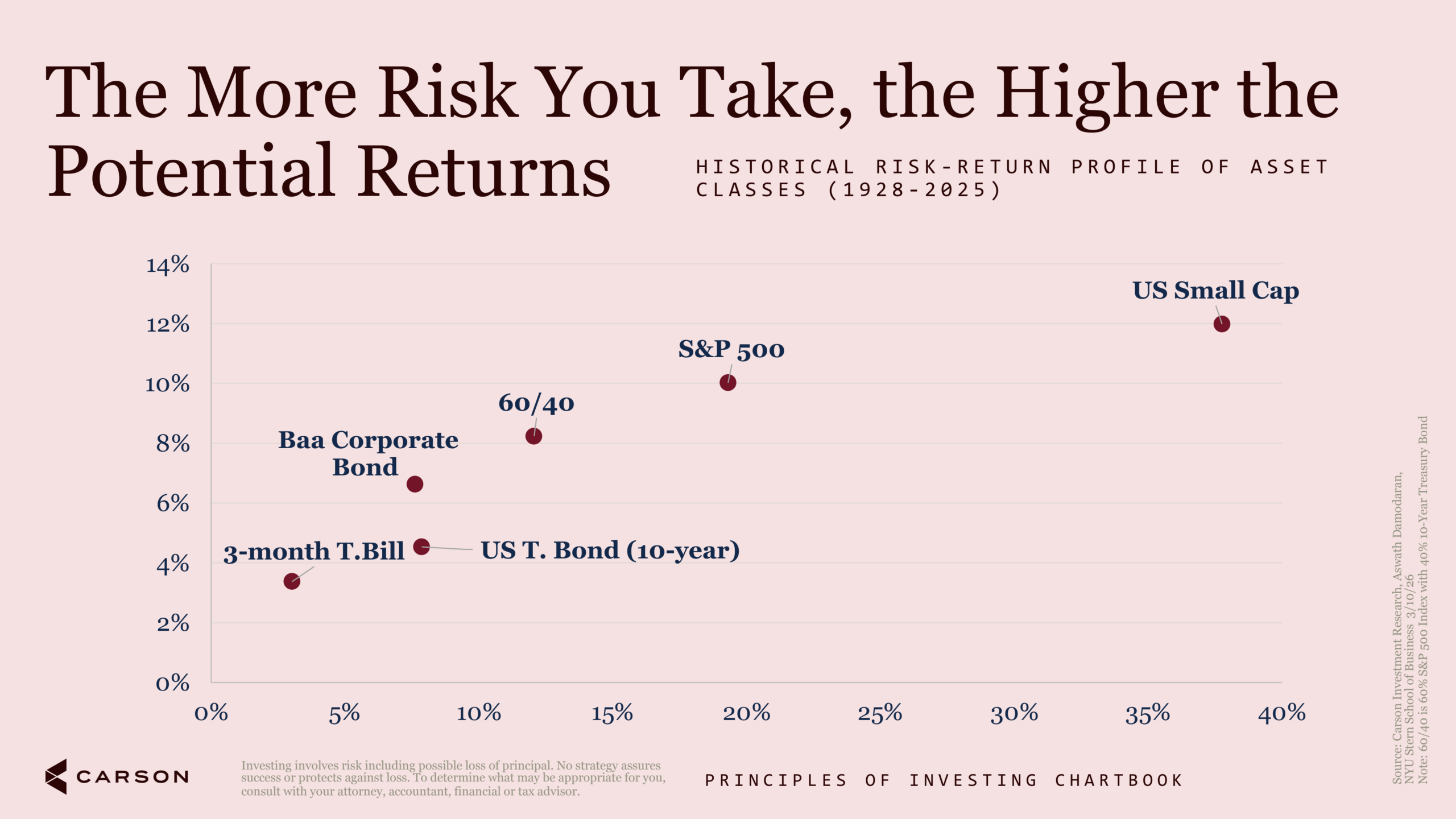
Here’s the historical trade-off between risk and return for some major assets, going all the way back to the late 1920s. The chart is close to a straight line going up and to the right, which is what finance theory says it should be. Small caps delivered the highest long-run returns of anything on the page. They also came with volatility roughly double the S&P 500’s. Three-month T-bills sat at the bottom on both axes.
There’s no free lunch here, and there never was or is in the finance world. What there is, is a choice about which club fits the shot in front of you.
It’s worth noting how relevant that question is right now. Coming into 2026, small caps had trailed large caps for five straight years, matching the longest such streak on record. Then in the first half of this year the Russell 2000 gained over 22%, its best first half since 1991, and beat large caps by about 12 percentage points, the widest first-half gap since 2001. Anyone who had spent five years concluding small caps were structurally broken picked a bad moment to act on it.
You Carry 14 Clubs For a Reason
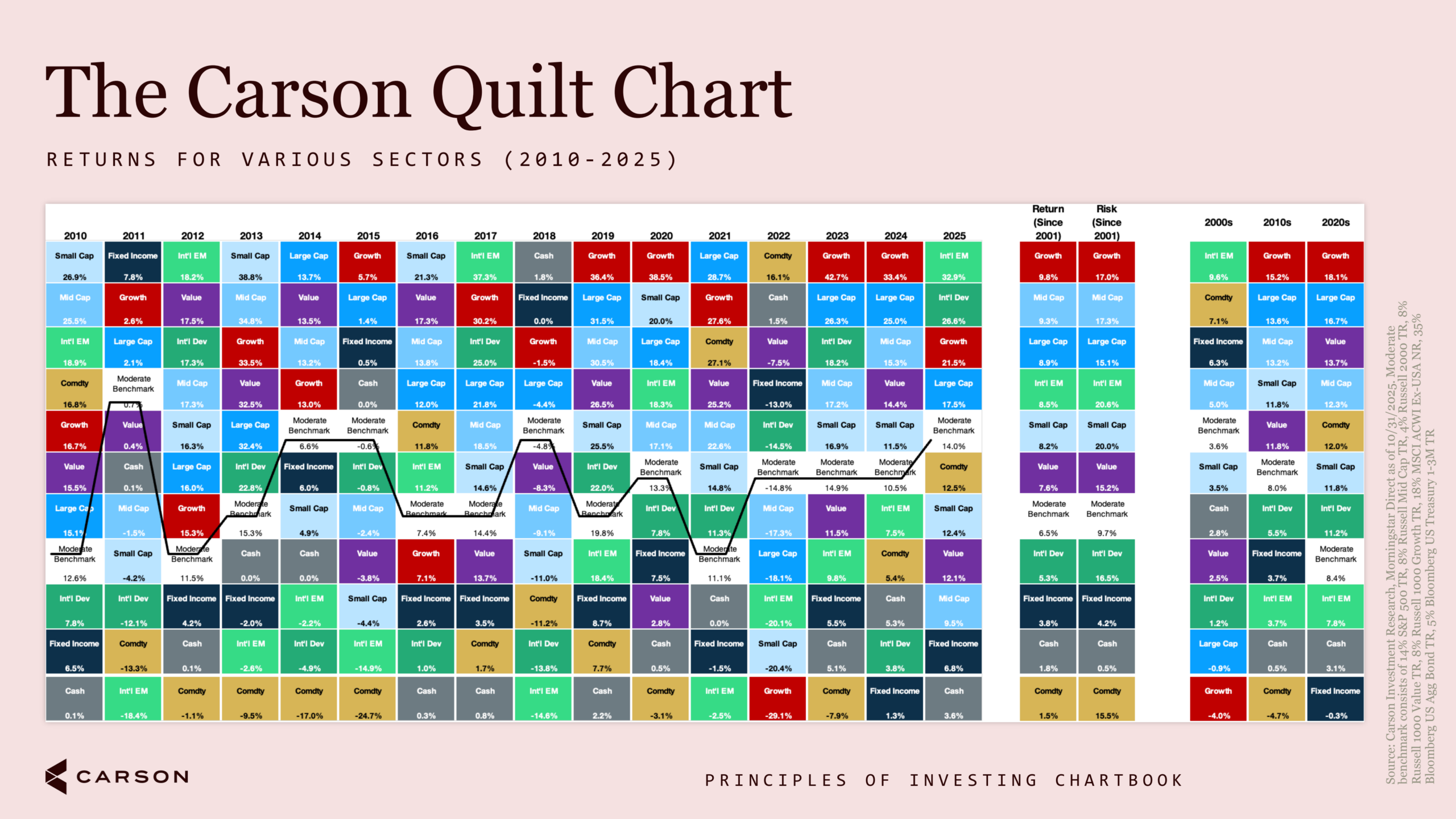
Here, every column is a year. Every color is an asset class. The observation is that the colors move constantly. Emerging markets on top in 2010 and dead last in 2011. Commodities at the bottom for most of the 2010s and at the top in 2022. Nothing stays at the top of the chart, and nothing stays at the bottom.
Now follow the black line, which is a diversified moderate portfolio. It’s essentially never the best performer in any single year. It’s also essentially never the worst. It sits in the middle, year after year, and ends up somewhere most people would be really happy to be.
Never finishing first isn’t the cost of diversification. It’s the strategy doing exactly what it was built to do. You’re not trying to win any single year; you’re trying to be holding something that works in a year you didn’t see coming. A portfolio should look like a full bag, not 14 copies of your favorite club.
A Bad Hole Is Expected. A Bad Round Is Optional
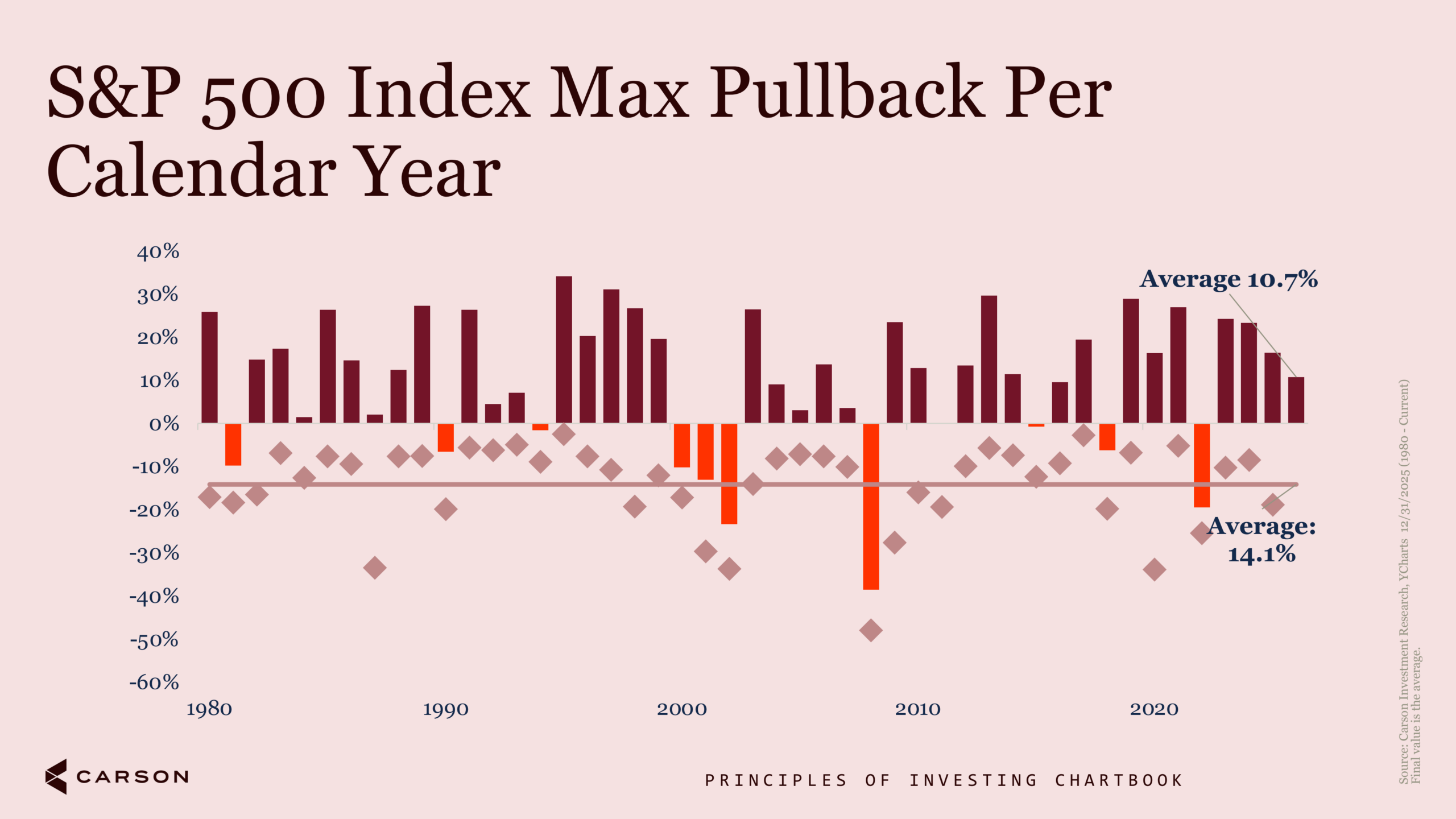
Since 1980, the average year has produced a return of about 10.7%. The average year has also produced a maximum drawdown of about 14.1%.
Both of those things are true at the same time. The average good year still contains a stretch that feels like it isn’t going to be a good year. You do not get one without the other. Volatility isn’t a malfunction of the process.
The scorecard doesn’t ask how you felt on the 12th tee. It asks what number you wrote down at the end.
Some Holes Are Just Harder
Some years are just harder too. We have written about this concept a lot this year, and I think it’s such a good lesson overall.
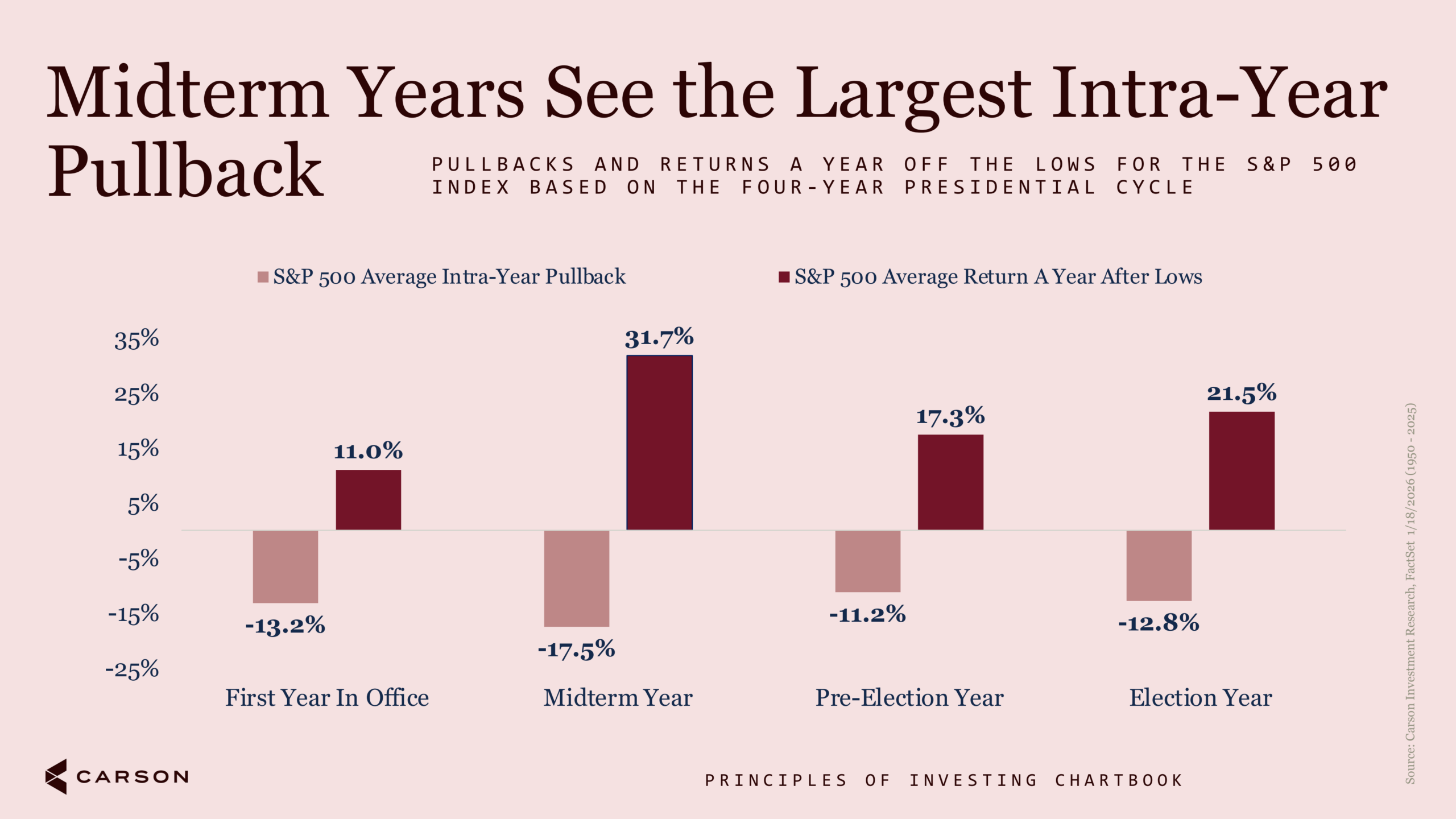
Midterm years have historically been the roughest stretch of the four-year cycle. Since 1950, the average midterm year has seen a maximum pullback of 17.5%, worse than any other year in the cycle.
They’ve also produced the best recovery. A year off those midterm lows, the S&P 500 has averaged a gain of 31.7%, well ahead of the 11.0%, 17.3%, and 21.5% that follow the lows in the other three years.

Stay on Top of Market Trends
The Carson Investment Research newsletter offers up-to-date market news, analysis and insights. Subscribe today!
"*" indicates required fields
We’re in a midterm year now. I’m not predicting a 17.5% drawdown, but if we get one, it would be somewhere between unremarkable and expected, and the historical record suggests that selling into it has been the expensive move.
Know which hole you’re standing on. Play it accordingly. Don’t rewrite your entire strategy because the tee box looks intimidating.
Crowd Noise Is Just Part of the Game
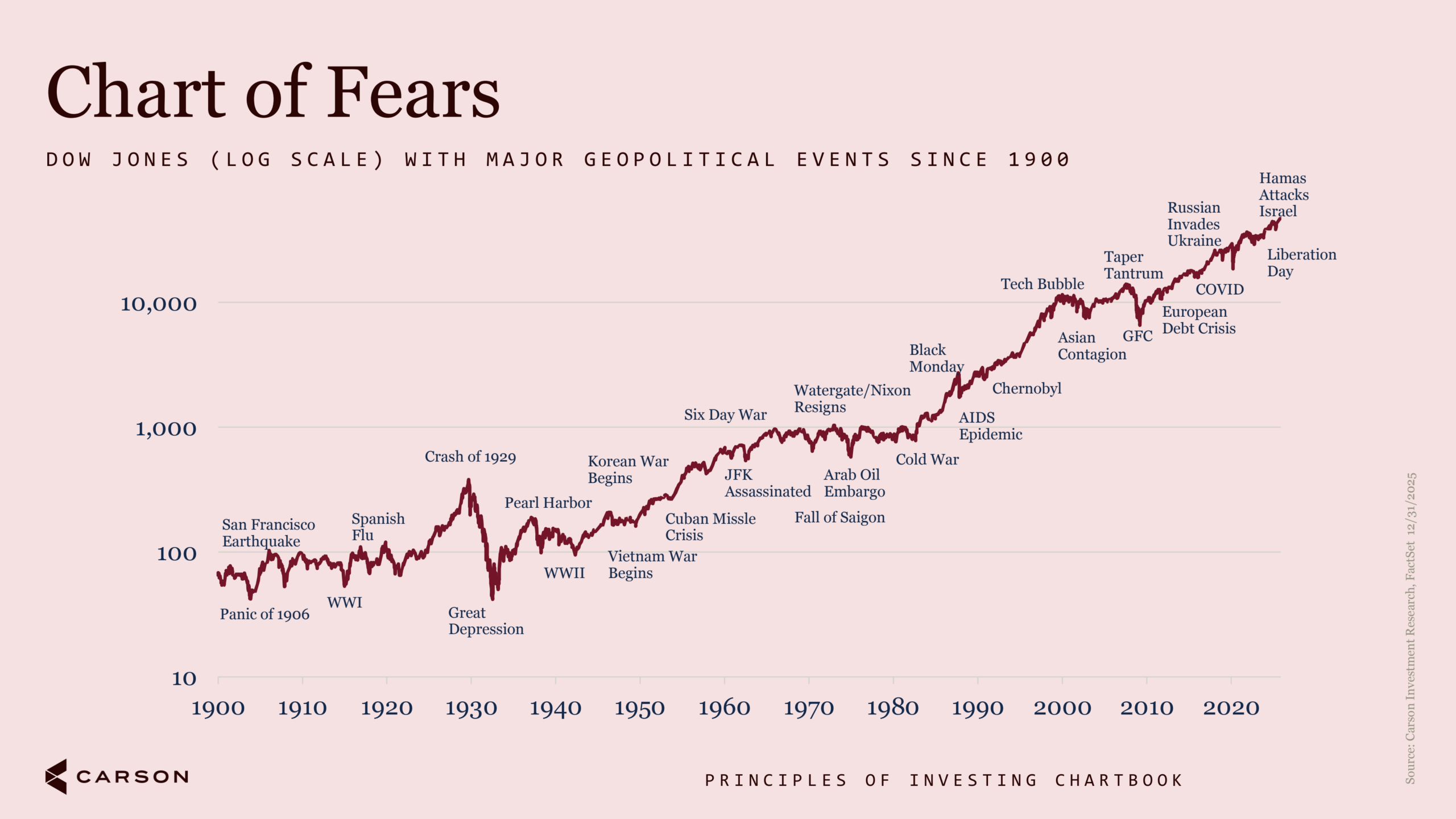
Panic of 1906. Two world wars. The Crash of 1929. Cuban Missile Crisis. Arab oil embargo. Black Monday. Tech bubble. Global Financial Crisis. COVID. Every one of those was, at the time, an entirely reasonable argument for getting out.
However, big picture, the Dow kept advancing through all of it.
I want to be careful here, because this chart is easy to misuse. It is not an argument that nothing bad ever happens or that risk isn’t real. People who bought at the 1929 peak waited 25 years to get back to even. Japan’s Nikkei took over 30 years. “It always comes back” is not a plan nor a strategy we would recommend.
What the chart argues is that events that dominate the headlines and feel most obviously like a reason to sell have generally been terrible sell signals. As I write this, the market is digesting Middle East tensions, a new Fed chair in Kevin Warsh, core inflation running near 3.5%, and a rate-cutting path that just got materially more uncertain. All of that is worth analyzing. Almost none of it is worth restructuring a 30-year portfolio over.
Playing Well Is Not a Reason to Walk Off the Course
One of the biggest things rattling around in my head right now is the idea that “the market’s at a record high, shouldn’t I wait for a dip?”
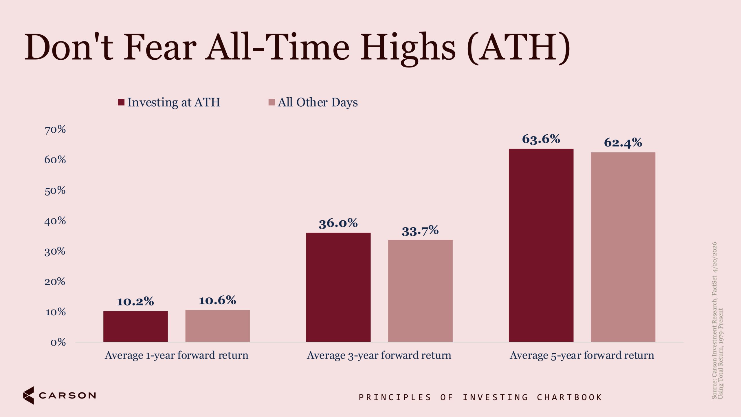
Money invested on a day the S&P 500 closed at a record high has gone on to earn about 10.2% over the next year, versus 10.6% for money invested on any other day. Over three years it’s 36.0% versus 33.7%. Over five years, 63.6% versus 62.4%.
Which is to say it makes essentially no difference, and if anything the record highs have been slightly better over longer horizons. Records tend to cluster, and markets in uptrends make a lot of them.
For context, the S&P 500 closed at 24 record highs in the first half of 2026 alone. The ride sure was bumpy, but that market is happily sitting up around 8% YTD. If the high valuations scared you in January, you’d be missing out on an above-average return year so far.
That doesn’t mean valuations are irrelevant. The forward P/E on the S&P 500 is around 20.4 against a 10-year average near 19.0, and my colleague Sonu Varghese has written thoughtfully about why this period may look like a bubble in hindsight. Rich starting valuations have historically meant lower forward returns. But “expensive” and “sell everything because we hit a new high” are very different statements.
The Scorecard Gets Filled Out Over Time
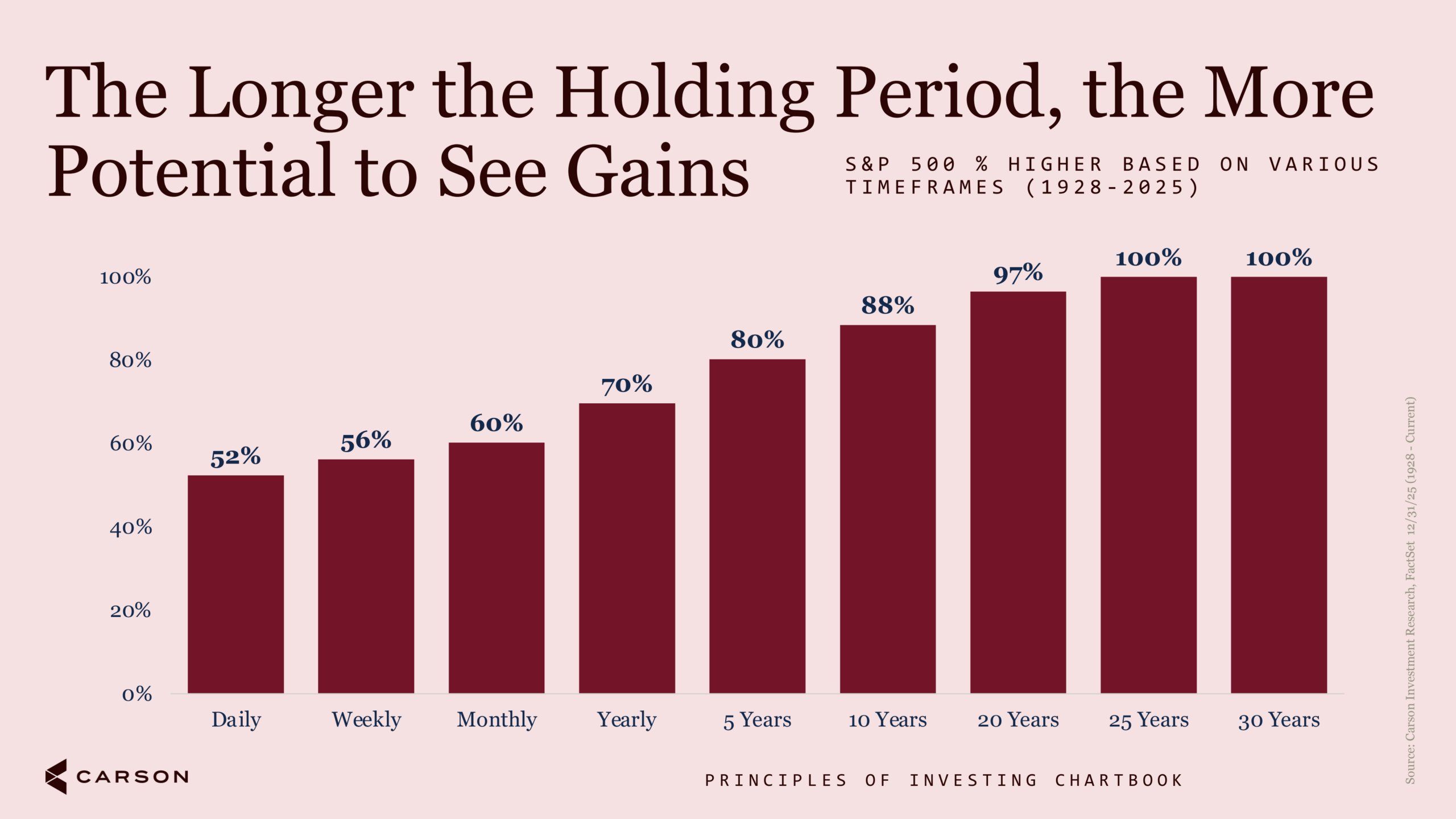
Pick a random day since 1928, and the S&P 500 was higher 52% of the time. Basically a coin flip. Stretch that to a year, and it’s 70%. Five years, 80%. Ten years, 88%. Twenty years, 97%. At 25 and 30 years, 100%.
Nothing about the market changed across those rows. The only variable is how long you were willing to stay on the course.
As Warren Buffett, the Omaha (Goat), would say:
“The stock market is a device for transferring money from the impatient to the patient.”
Stay invested, and you’re likely to be happy with your decision, but it will take patience.
Go Look at the Chartbook
There are 20 charts in the Principles of Investing Chartbook, and I’ve put eight in here. The rest cover what inflation does to returns over time, how bonds behave when yields are elevated, why a split Congress has historically been fine for stocks, and where interest rates have sat over the past century.
We designed it to be evergreen. If a chart’s message changes when you add twelve months of data, it was never a principle to begin with.
I still make triple bogeys. I’ve just gotten better at making sure the next hole isn’t one too. Happy investing!
By Harry McDonald, Analyst, Investment Research
9049503.1. – 29JULY26A