
What a first half it’s been. We had a war, an oil spike, a 9% pullback, a furious rally, a bull market that keeps getting called old, and an AI trade that keeps getting even more interesting (and confusing). Altogether, 6 months felt like 6 years.
So to mark the halfway point, the Carson Investment Research team wanted to tackle a simple question: What were some of our favorite charts of the first half of 2026? Then I asked them to tell me why, in their own words. Below is what came back, along with my own pick at the end.
This Is Just Another Typical President Trump Year
Ryan Detrick, Chief Market Strategist, kicks us off with the big picture, and it’s a great chart that best explains how the whole first half felt:
“It amazes me how this year looks like your average year under President Trump. Early weakness is common; panic and worry take over; long-term bullish strategists start cutting targets and talking about bad things on TV; then stocks bottom in late March/early April and rally for the rest of the year. Once again this year, it all happened: we had a perfectly normal 9.1% pullback in the S&P 500, yet the panic we saw surrounding higher oil prices and the war in Iran was off the charts. Then sure enough, the masses once again expected the worst and missed out on huge gains.”
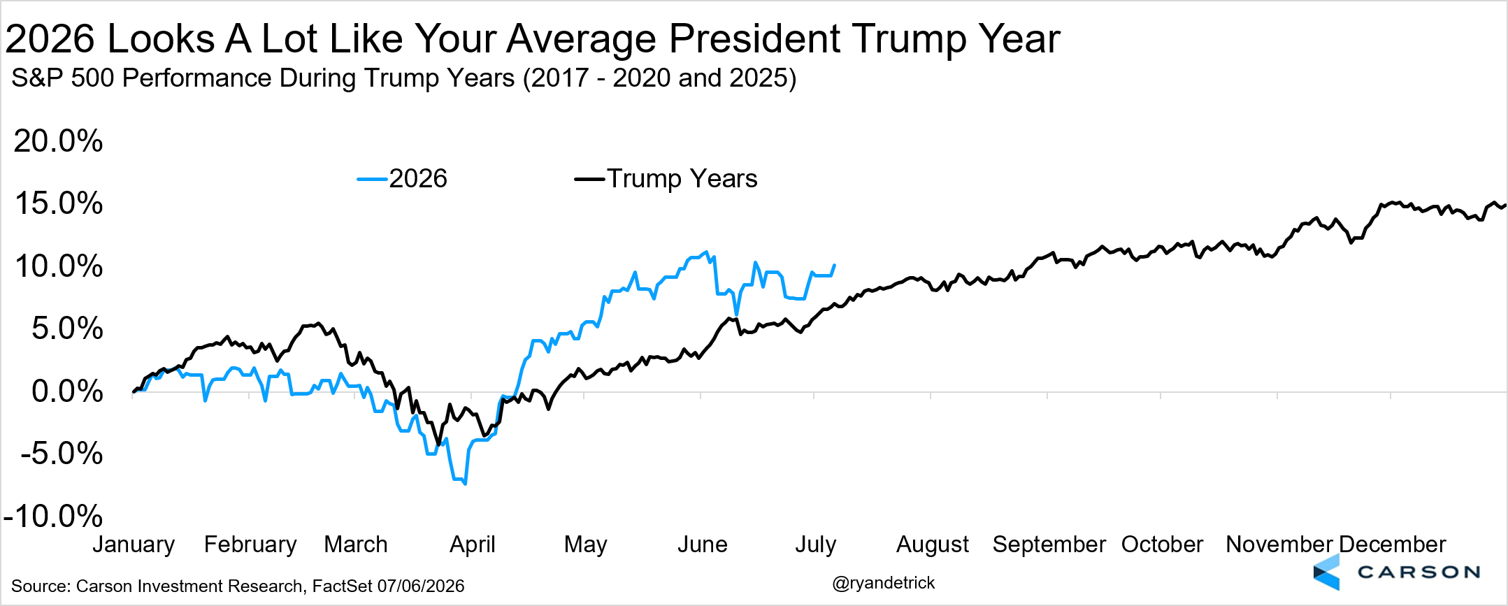
If you overheard the conversations in March and then looked at this chart today, you’d have a hard time believing they described the same market.
The Inflation Problem Is Bigger Than Oil
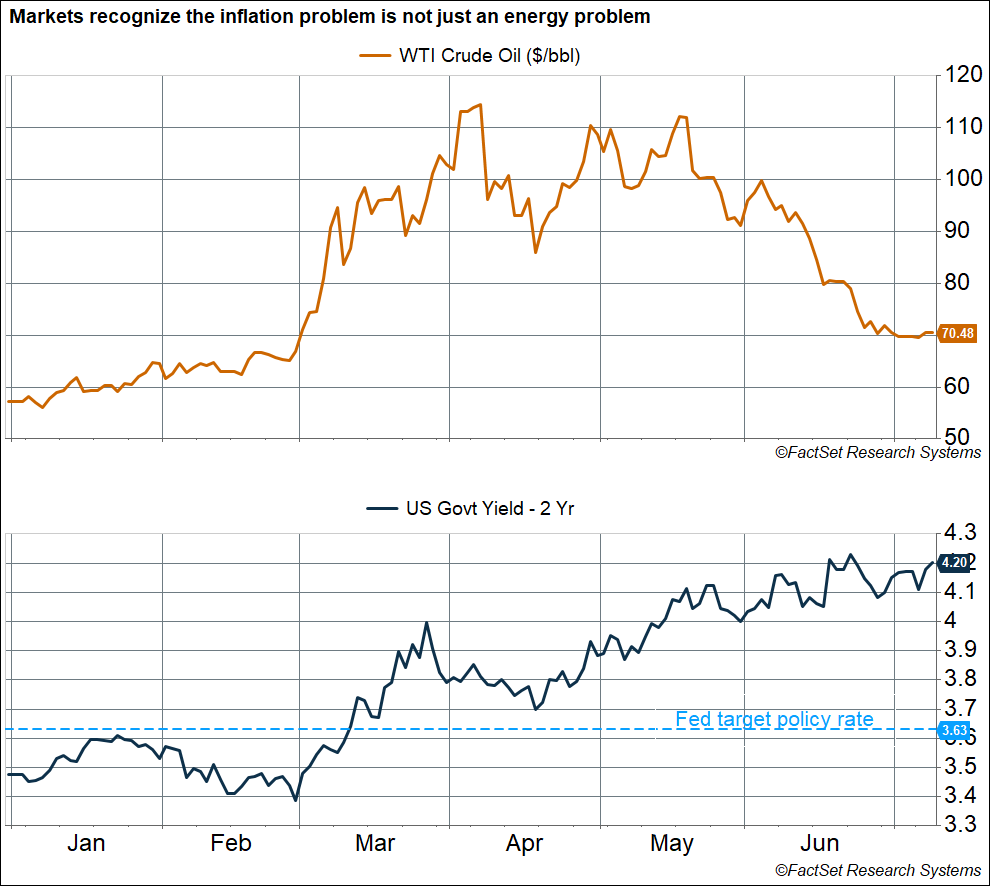
Of course, the reason March felt so scary was what was happening in the oil market. Sonu Varghese, Chief Macro Strategist, picked a chart that tells the more subtle macro story of the half:
“The most striking chart for me shows the movement of oil prices and 2-year yields in 2026. Oil prices are currently around $70/barrel (WTI), only slightly higher than the $67/barrel on the eve of the Iran war (February 27th). Prices have plunged from peak levels above $110/barrel in April. Yet 2-year yields, which are an average estimate of the Fed’s policy rate over the next two years, have continued to climb and are sitting at the highest levels we’ve seen since early 2025. The 2-year yield is at 4.20%, well above the Fed’s current policy rate of 3.6% — telling you that markets expect the Fed to raise rates sooner rather than later and keep them elevated. That’s a huge shift from where we were at the start of the year, when the market expected several rate cuts.
In other words, the market has increasingly recognized that the inflation problem goes beyond energy, which is why short-term rates have continued to climb despite oil prices making a round trip. Inflationary pressures are broad-based, including AI-related bottlenecks, tariffs, and non-housing services. Most Fed members are clearly hoping the inflation problem is “transitory” (once again), but if it doesn’t prove to be so and inflation remains elevated, we could see a rush to hike rates. That could result in rough sailing for this bull market as we get into its fifth year (after October).”
The A.I. Trade Moves to Memory
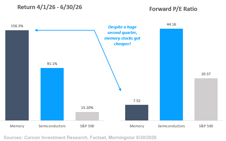
From the macro to the market’s favorite subject: AI. Grant Engelbart, VP, Investment Strategy & Research, found the corner of the trade where things got a little wild in the second quarter:
“The A.I. trade and the expected impact surrounding its growth continue to create huge winners and losers, and even several winners that have become losers and vice versa. One microcosm of this phenomenon has played out in the second quarter alone. Surging A.I. server demand, which relies on specialized memory at a time when that memory is scarce, has created a large supply/demand imbalance that has propelled a subset of stocks substantially higher. On top of this, future demand expectations and pricing power are so high that earnings expectations have increased even more than prices, in many cases causing P/E ratios for stocks in that space to fall.
Traditional semiconductors, which have had a great run of their own, trade at 44x the next 12 months’ earnings, versus just 7x for memory stocks (which are typically classified as semiconductors)! One particular memory ETF was launched on 4/1/2026 and caught lightning in a bottle, not only more than doubling in returns over the time period, but taking in nearly $22 billion, marking one of the most successful ETF launches of all time.”
When What You Think You Know, Just Ain’t So
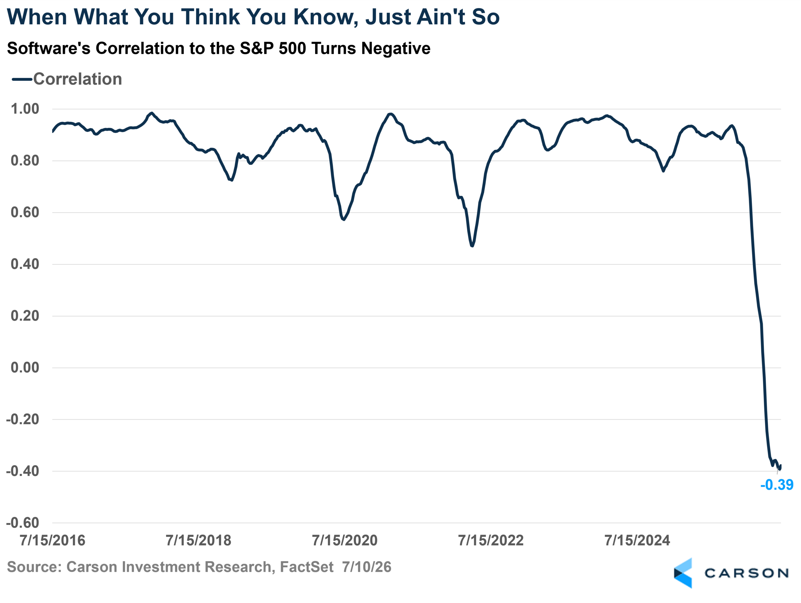
But every winner in the AI trade seems to come with a loser attached. Blake Anderson, Director, Portfolio Management, picked the chart that flipped a decade of conventional wisdom on its head:
“What software investors thought they knew coming into the year proved to not be so: the industry’s correlation to the broader market has gone negative! For the past decade, the software industry has traded with a high and tight correlation to the S&P 500, spending most of the time above 0.8. Put differently, it was a pretty safe bet over the last decade that software stocks would move in a similar direction to the S&P 500.
But that just ain’t so in 2026! Software entered 2026 with a 52-week correlation to the S&P 500 of 0.85. That correlation has plummeted to -0.39! Software is down as the market is up, bucking the trend of the last decade. This breakdown comes as investors perceive that semiconductors — the market’s darlings so far in 2026, as Grant Engelbart, VP, Investment Strategy & Research, showed above — are eating software alive.”
The Magnificent 7 Aren’t the Only Game in Town
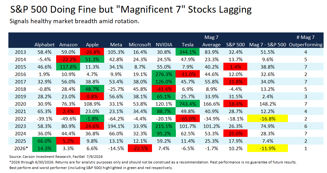
Software isn’t the only long-time leader taking a back seat. Barry Gilbert, VP, Asset Allocation Strategist, picked a table that captures one of the most surprising shifts of the year:
“The tech-oriented megacap ‘Magnificent 7’ stocks (Alphabet, Amazon, Apple, Meta, Microsoft, NVIDIA, and Tesla) have been market leaders for more than a decade. The moniker was coined by Bank of America analyst Michael Hartnett in 2023. Meta was the last of the seven to go public in May 2012, so we have a calendar-year return history for the Mag 7 starting in 2013, shown below. While all seven are young relative to our entire market history, the decades in which they went public are quite dispersed (two in the 1980s, including Apple, the oldest; two in the 90s; one in the 2000s; and one in the 2010s). As a group, they are taken to represent US tech innovation and market dominance. And indeed they have been dominant, although that’s easy to say in retrospect.

Stay on Top of Market Trends
The Carson Investment Research newsletter offers up-to-date market news, analysis and insights. Subscribe today!
"*" indicates required fields
But not in 2026. As of midyear, only one Mag 7 company has outperformed the S&P 500. And while we are only at midyear, if the year ended now, it would be only the second time that an equal-weighted average of Mag 7 returns would have underperformed the S&P 500. Notably, the last time it happened (2022) was a bad year for the S&P 500, while this year has been a pretty good one, with the broad index boasting a 10.2% return at the year’s midpoint. Solid index performance despite Mag 7’s underperformance indicates that market breadth has been very strong. It also tells us that markets have reoriented themselves toward companies that benefit from AI capex rather than those doing the spending. Even with that, Mag 7 earnings expectations for 2026 still outpace the rest of the index by a good margin. These are still solid companies; they’re just not the only game in town.”
Earnings Grew a Lot Faster Than Sales
The last one is mine. The headline from Q1 earnings season was that earnings were strong, but my favorite chart of the first half shows how they were strong, and I think that’s a little more interesting.
Eight of the eleven S&P 500 sectors grew earnings faster than revenue, and in some cases, it wasn’t even close. Info Tech grew EPS 54.8% on 31.9% revenue growth. Communication Services nearly hit 49% EPS growth on 15% sales growth. Materials grew earnings at more than four times the pace of its top line.
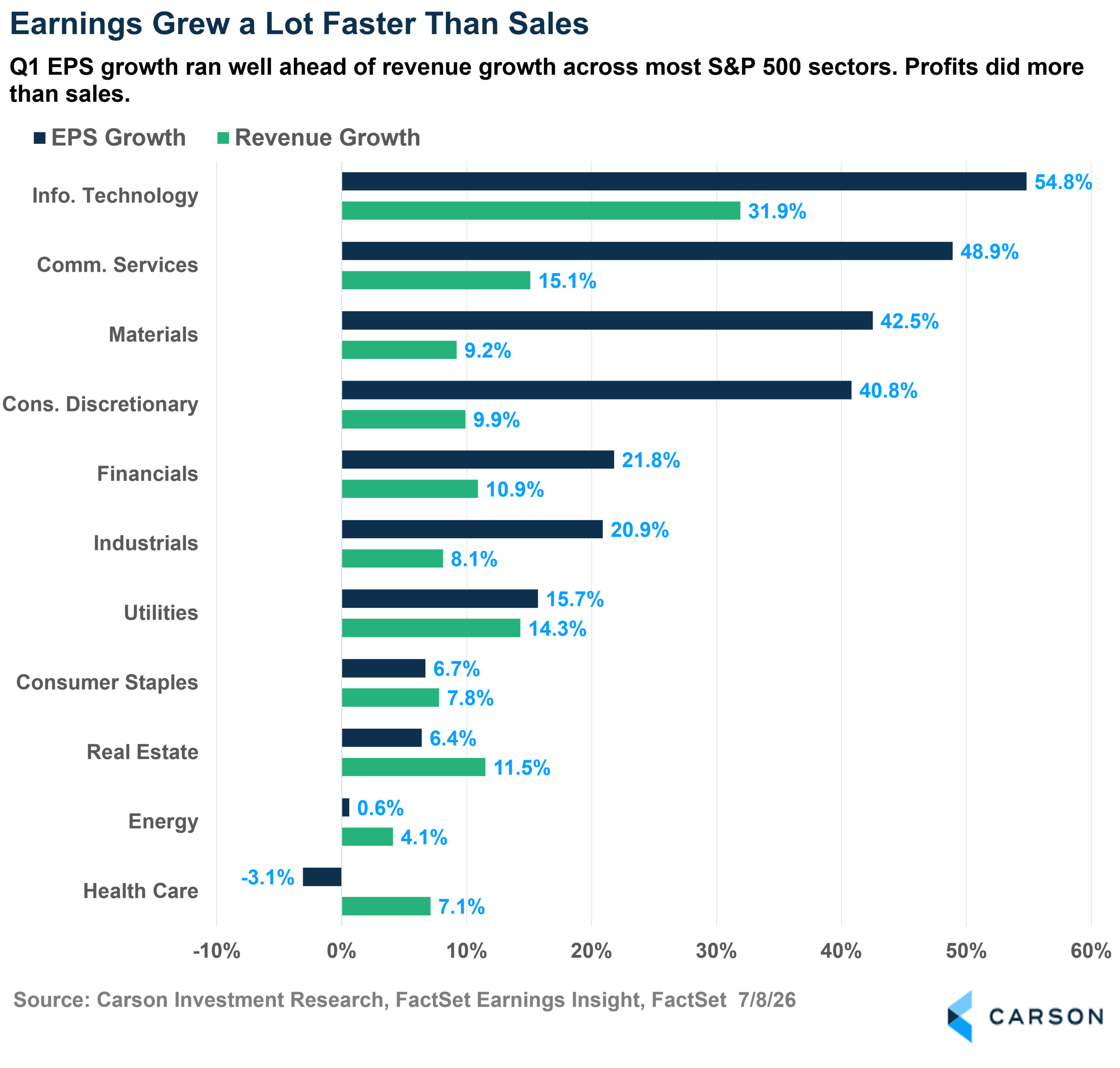
When profits outrun sales like this, it means this isn’t only about demand; it’s about what happened between the top and bottom lines. Margins expanded, buybacks shrank share counts, and some sectors were lapping a soft stretch a year ago. Whatever the mix, corporate America squeezed a lot of profit out of every dollar of sales in the first quarter.
However, the other side matters too. Health Care grew revenue by 7% while earnings actually fell. Selling more and earning less is the toughest spot in business, and it’s a reminder that this earnings strength, while broad, wasn’t universal.
Wrapping It Up
Six charts, one overall theme: the market spent the first half of 2026 rewriting the rules everyone thought they understood. The Mag 7 stopped leading, software stopped tracking the index, and oil stopped driving the inflation narrative. Meanwhile, the index itself just did what it usually does: climbed a wall of worry, up more than 10% at the half.
If the first six months taught us anything, it’s that the consensus view has a short shelf life in this market. Our team will be watching all of these stories closely in the second half, and we’ll keep sharing what we find right here.
Thanks to Ryan, Sonu, Grant, Blake, and Barry for playing along. Here’s to an interesting back nine of 2026.
For more content from the Carson Investment Research team, click here.
By Harry McDonald, Analyst, Investment Research
9017657.1. – 10JULY26A