
Well, that’s a wrap on 2025. While the year came with its share of volatility, shifting narratives, and policy uncertainty, markets once again proved resilient. Beneath the headline moves, several powerful themes shaped returns, from inflationary growth signals and earnings durability to global divergence, commodity portfolio allocation, and investor behavior during drawdowns.
To help close out the year, I once again asked members of the Carson Investment Research team to each choose a Chart of the Year for 2025. Together, these charts tell the story of the year that was — and hint at what may lie ahead.
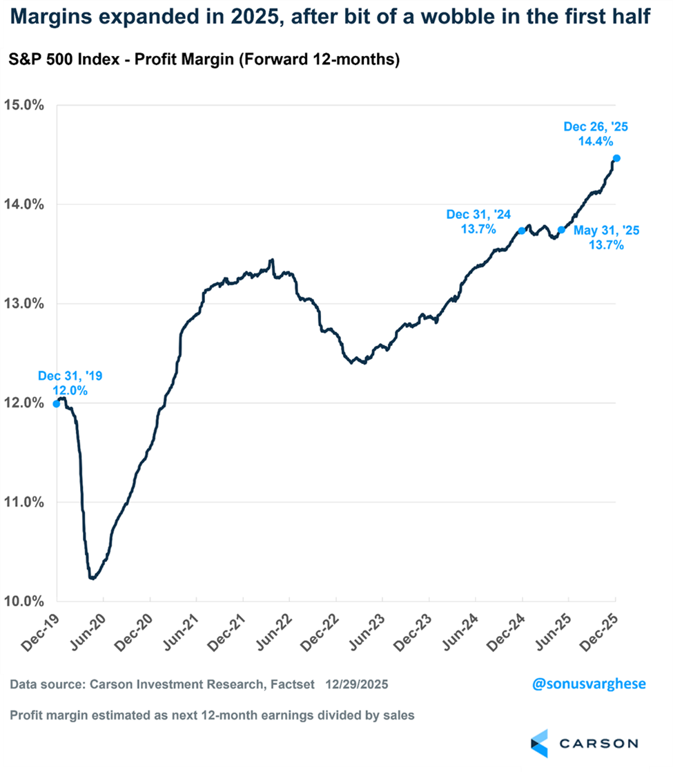
Expanding Margins Reflect the Resiliency of American Firms
Let’s start with Sonu Varghese, VP, Global Macro Strategist, who looks under the hood of the market’s engine. While some headlines obsessed over politics and trade wars, Sonu points out that the real story was the surprising durability of American corporate profitability.
From Sonu: “The S&P 500 has gained 17.9% in 2025, of which 14.3 percentage points (“pp”) came from forward earnings growth, 2.1pp from multiple expansion, and 1.5pp from dividends. So over three-quarters of the return was driven by profit growth expectations, the largest proportion since 2021. But the key is what drove profit growth. Profit growth can be broken into two pieces: sales growth and margin expansion. Sales growth contributed 8.8pp to the index return, which shouldn’t be a big surprise given that nominal GDP grew at an above-trend pace of 5-6% (with over half of that coming from elevated inflation). But margin expansion contributed a significant 5.5pp, as forward margin expectations rose from 13.7% at the start of 2025 to 14.4% by year end. That’s why this chart showing margins is my Chart of the Year, as it captures the dynamics of 2025 quite nicely.
In April, amidst the tariff chaos, it wasn’t a given that margins would expand. In fact, the administration was actively looking to remake the global trade regime with heavy tariffs—but that same trade regime that was being changed is also how US companies have generated profits and expanded margins over the past quarter century. Margins wobbled up until May, then increased again, essentially capturing the so-called TACO trade, as the administration pulled back on most of its tariffs amid pushback from both the stock and bond markets. At the same time, average effective tariffs remained about 10%-points above where they were in January, increasing the cost of doing business. But companies were able to boost margins even in the face of this by raising prices, cutting costs, and becoming more efficient. Part of the efficiency came from curbing hiring, as the chart also reflects, in some ways, the labor market weakness we’ve seen this year. American firms are perhaps the most dynamic, well-run, and adaptable companies that we’ve seen in history, and what happened in 2025 underlines that companies were able to boost profits by expanding margins in the face of massive policy headwinds and economic uncertainty.”
Every Year Has Some Bad Days—Don’t Panic
Next up is Ryan Detrick, Chief Market Strategist, who reminds us that even in a banner year, the market will always test your conviction. His chart is a perfect lesson in why panic is rarely a strategy and why the best days often follow the worst.
From Ryan: “It is so hard to pick just one chart to sum up 2025, but what stands out about this year to me is we had some historically bad days back in March and April, yet stocks came soaring back soon after. One thing I like to point out is that every year has its share of bad days and scary headlines. 2025 wasn’t the first year in history to avoid this curse, and 2026 likely won’t be the first either.
Immediately after Liberation Day, the S&P 500 fell 10.5% in two days, one of the largest two-day drops in history. We shared the chart below many times back then, and our warning was that the worst and best days tend to cluster together, so if you sell during some bad days, you’ll likely miss the good days ahead. Well, sure enough, history repeated itself, and soon after the early-April weakness, we saw a nearly 10% bounce on April 9, and it was off to the races from there.
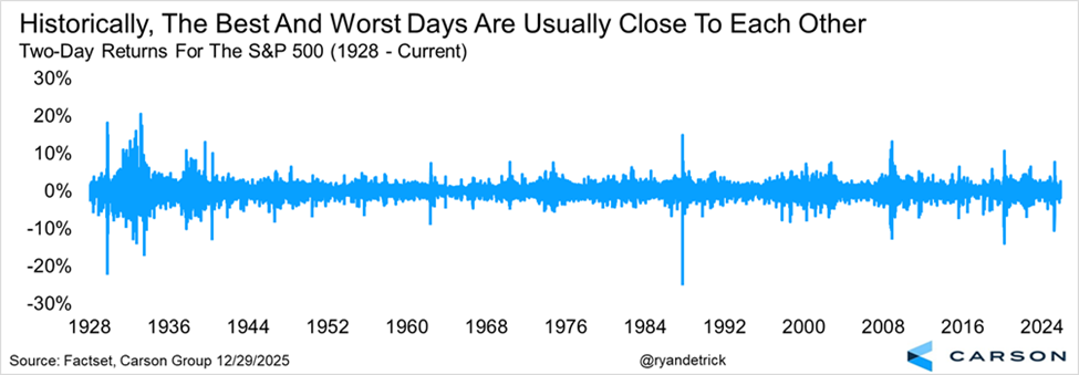
President Eisenhower said that plans were useless, but planning was everything. Plan for some bad days and large daily drops in 2026; that way, when they happen, you will be better prepared.”
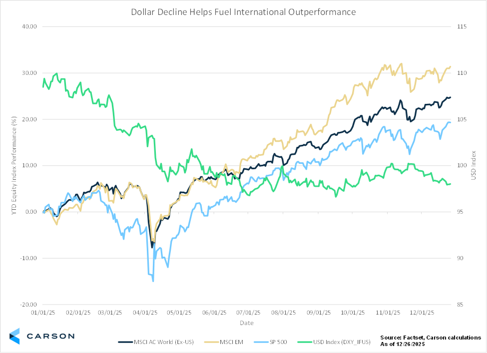
Dollar Decline Helps Fuel International Outperformance
For years, the U.S. dollar has been the only game in town, often acting as a headwind for global diversification. Mike Lawrence, Portfolio Manager, highlights that 2025 was the year the script finally flipped, providing a massive tailwind for international equities.
From Mike: “Seasoned U.S. international travelers know that a weaker dollar is not good when venturing outside of the country. Everything from accommodations to kitschy souvenirs is suddenly more expensive as the USD’s purchasing power weakens relative to a foreign currency.
However, one area where a weaker dollar can be a positive for U.S. buyers is international stocks. After years of trailing U.S. stocks, international equities staged a strong comeback in 2025, with the MSCI AC World (ex-US) and MSCI EM both outperforming the S&P 500 by a wide margin.
While regional policy tailwinds, attractive relative valuations, and investors seeking diversification beyond the US megacap “Magnificent 7” all help fuel the outperformance, the weakening U.S. dollar this year was a major tailwind for international equities. That is because, all else being equal, a weakening dollar makes your foreign-dominated investment worth more in U.S. dollars.
Reasons behind the dollar’s decline this year are varied: Fed rate cuts, U.S. policy uncertainty, and shifting global capital flows are among them. Whether these trends continue into 2026 remains to be seen, but an asset allocation beyond U.S. borders was certainly beneficial in 2025, even if that Eiffel Tower keychain was more expensive.”
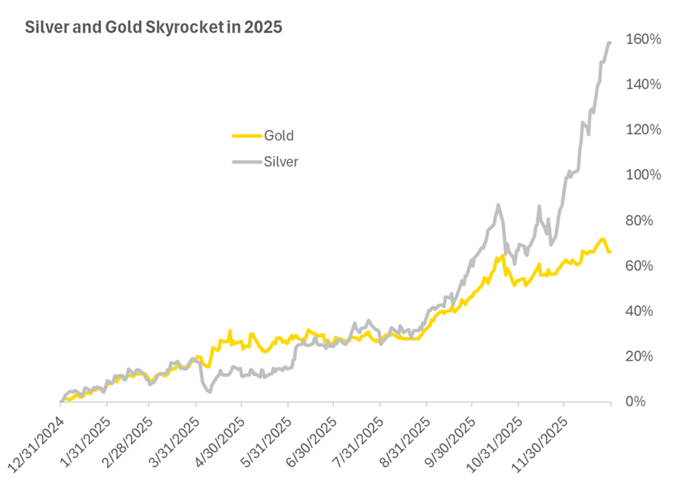
Gold and Silver Skyrocket in 2025
Next up is Grant Engelbart, VP, Investment Strategy & Research. While stocks grabbed the headlines, Grant notes that 2025 was also the year “hard assets” returned to the conversation. His chart highlights the stunning resurgence in precious metals, driven by a classic mix of supply and demand.
From Grant: “The price of gold (and gold’s more volatile cousin, silver) has jumped the most this year since 1979. With any commodity, it always comes down to economics 101: supply and demand. Silver and gold are finite resources with limited supply and can be impacted by global mining production. Gold is generally viewed as a safe-haven asset and a hedge against risks such as currency fluctuations, geopolitical turmoil, and other forms of risk-asset volatility, not to mention buying demand from central banks and consumers alike. Silver benefits from similar store-of-value demand to gold, but it also has a number of industrial uses, such as batteries, circuit boards, and medical devices. This widespread demand and limited supply have led to a near 160% gain in the price of silver in 2025, with over half of that gain coming in just the last few months.”
Sources: Carson Investment Research, Factset 12/30/2025
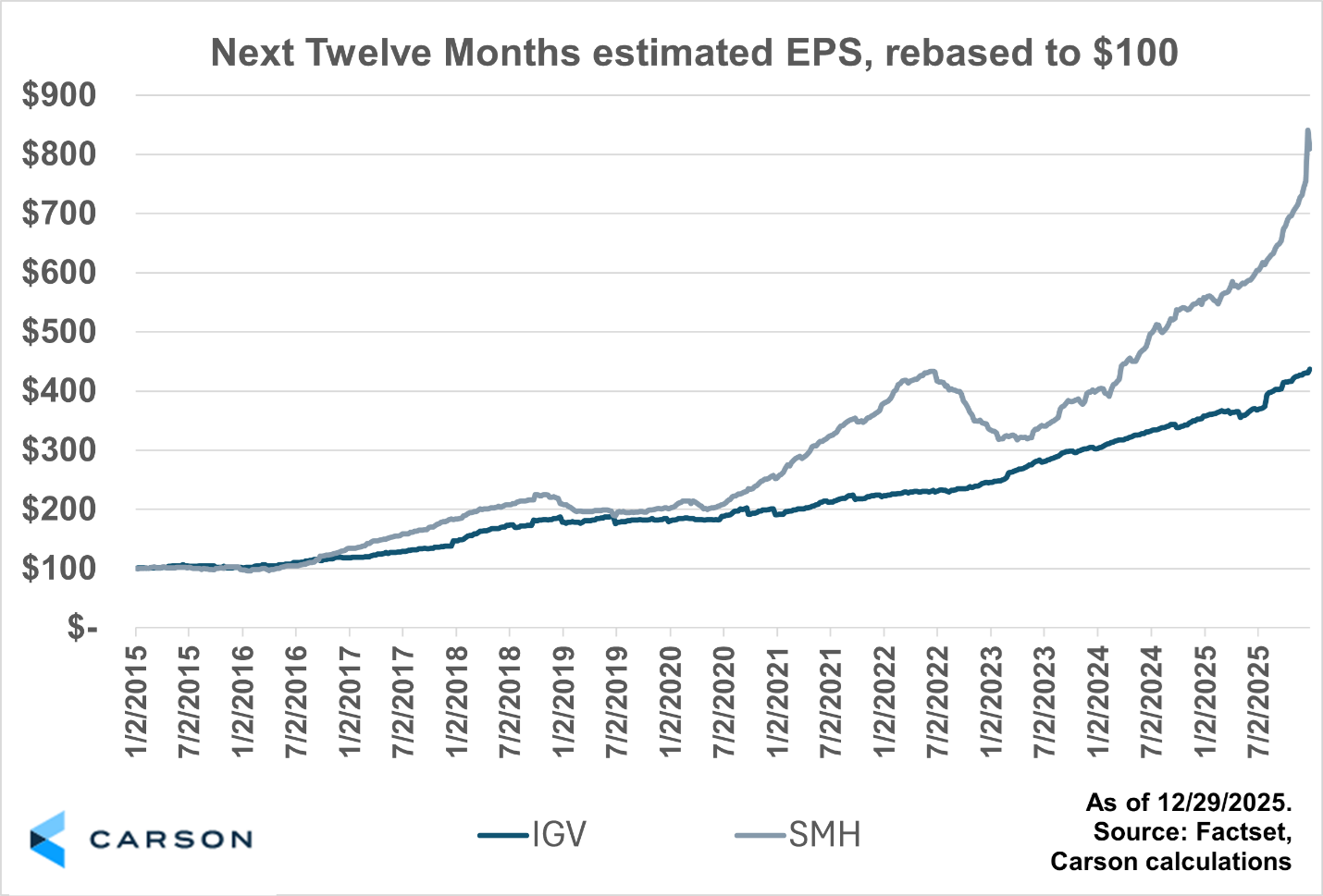
Semiconductors Steal the Show in 2025
We can’t talk about 2025 without mentioning the engine of the modern economy: technology. However, Blake Anderson, Associate Portfolio Manager, cautions that treating “tech” as a monolith is a mistake. His chart highlights a massive divergence within the sector, proving that not all growth stories were created equal this year.
From Blake: “The tech trade was dominated by semiconductors (again) in 2025. SMH (a semiconductor-focused ETF) is up 48% year to date, whereas XLK (S&P 500 Technology Sector) is up 25%, and IGV (a software-focused ETF) is up a measly 7.5% (all FactSet data as of 12/29/2025).
The outperformance of semiconductor stocks in 2025 can largely be attributed to EPS estimates for the group moving sharply higher, as shown below. Analysts’ expectations for the earnings of SMH over the next twelve months has increased 45% this year (compared to IGV’s 22% increase). Since the end of 2022, earnings expectations for SMH have increased 142%, whereas earnings expectations for IGV have increased ‘only’ 72%—a reminder that not all tech stocks act alike!”
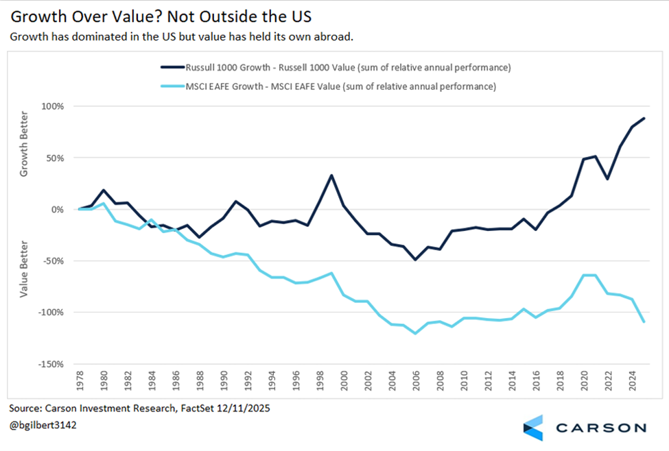
Growth Over Value? Why It’s a US-Only Phenomenon
Building on the international theme, Michael Barczak, VP, Investment Due Diligence, digs deeper into what kind of companies drove returns globally. His chart reveals a stark divide in style between the U.S. and the rest of the world: while American markets remain the undisputed king of “Growth,” international markets are finding their strength in “Value.” This divergence defined manager performance in 2025.
From Michael: “This has been my favorite chart to look at when trying to explain why I believe the AI and technology-related market leadership that dominates the news is a US phenomenon rather than a global trend. This is especially useful when evaluating active manager attribution, as the context for a market’s or index’s performance, and any positive or negative excess performance an active manager generates, is heavily influenced by the differences in holdings. The US economy has increasingly been driven by high-margin, asset-light business models focused on intellectual property, software, platforms, data, and services, which naturally favor growth-oriented sectors. Non-US developed economies tend to be more reliant on capital-intensive, cash-flow-driven businesses in industries such as manufacturing, banking, energy, biopharma, materials, and other export-oriented sectors that align more closely with a value-oriented style. There are numerous dynamics within the labor and capital markets that have led to this divergence in the success of industries across regions. This has made evaluating international manager performance in 2025 much more interesting than evaluating US manager performance. In the US, excess returns over the past 5-10 years have generally boiled down to “were you overweight technology or this small subset of market movers (FAANG, Mag 7, etc.),” whereas international managers have had different and more diversified sources of excess returns to potentially capitalize on, putting a greater emphasis on manager skill.”
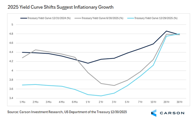
2025 Told by the Yield Curve
Finally, Barry Gilbert, VP, Asset Allocation Strategist, wraps things up with a look at the bond market’s signal. For Barry, the economic story of 2025 is best captured by the return to normalcy in the yield curve, as the Fed wrestled with its dual mandate.
From Barry: “A lot of the story of 2025 is captured in the yield curve as the Fed wrestled with its dual mandate of low and stable inflation and full employment. That’s why I’m choosing the yield curve as my Chart of the Year. Before looking at the curve, it’s worth noting that with intermediate Treasury yields falling, it’s been a decent year for bonds. The 10-year Treasury yield ended 2024 at 4.58% and was at 4.12% as of Monday. Falling yields added some price appreciation on top of attractive coupons for bonds (relative to much of the last 15 years), giving the Bloomberg US Aggregate Bond Index a healthy 7.5% year-to-date return as of Monday. Looking at how the curve has changed:
- Fed rate cuts did help pull down the 10-year yield this year. The three-month yield fell 0.69%-points as the Fed cut rates, versus a 0.46% decline over the year for the 10-year, a fairly normal relationship. But it’s noteworthy that most of the 10-year yield decline occurred by mid-year, when rates hadn’t been cut yet (and even out to six months, there wasn’t much priced in for 2025). Still, the curve was suggesting that policy was tight and that rates would eventually need to come down.
- At the same time, the longest part curve stayed well anchored in the first half of the year despite declines in some short-term yields and intermediate yields. That suggests inflation uncertainty was still in play even with some risk to growth being priced in.
- Once rates were actually cut, short yields declined, but 10-year yields didn’t move much more. The Fed was playing catch-up as some of the expected economic risks priced in faded. Long-term yields didn’t join the party at all and remained solidly anchored.
And that takes us to today. The yield curve tells us the story of the year, but it is also hinting at what we might see moving forward. As my colleague Sonu Varghese put it in a recent blog analyzing the Q3 GDP report, “the overall picture points to inflationary growth and that is not necessarily a bad thing for stocks.” We believe that’s the story the yield curve is telling right now as well.”
There you have it. A comprehensive look at 2025 through the eyes of our research team. From soaring margins and precious metals to the resurgence of international equities, the data tells a story of resilience. We are now counting down to the release of our Outlook 2026, where we will turn these lessons into a roadmap for the year ahead.
Happy New Year!
8687266.1. – 31DEC25A