
I was recently asked whether I was worried about rising debt delinquencies. It is true that transitions into serious delinquencies (90+ days of late payments, capturing borrowers who have missed three or more payments) have been rising for auto loans and credit cards. For auto loans, transitions to serious delinquencies are at 5.8% as of Q3 2023, and it’s at 2.5% for credit cards – both slightly higher than pre-pandemic. One reason may be that student loan payments have restarted and so perhaps some borrowers are starting to find it hard to make all their payments.
So, is this a cause for concern for the broader economy?
Rising delinquencies are not a good thing, but focusing on that misses the overall strength of American households. I’m going to walk through 10 charts to illustrate this. Let’s start directly with auto loans and credits card debt.
Stay on Top of Market Trends
The Carson Investment Research newsletter offers up-to-date market news, analysis and insights. Subscribe today!
"*" indicates required fields
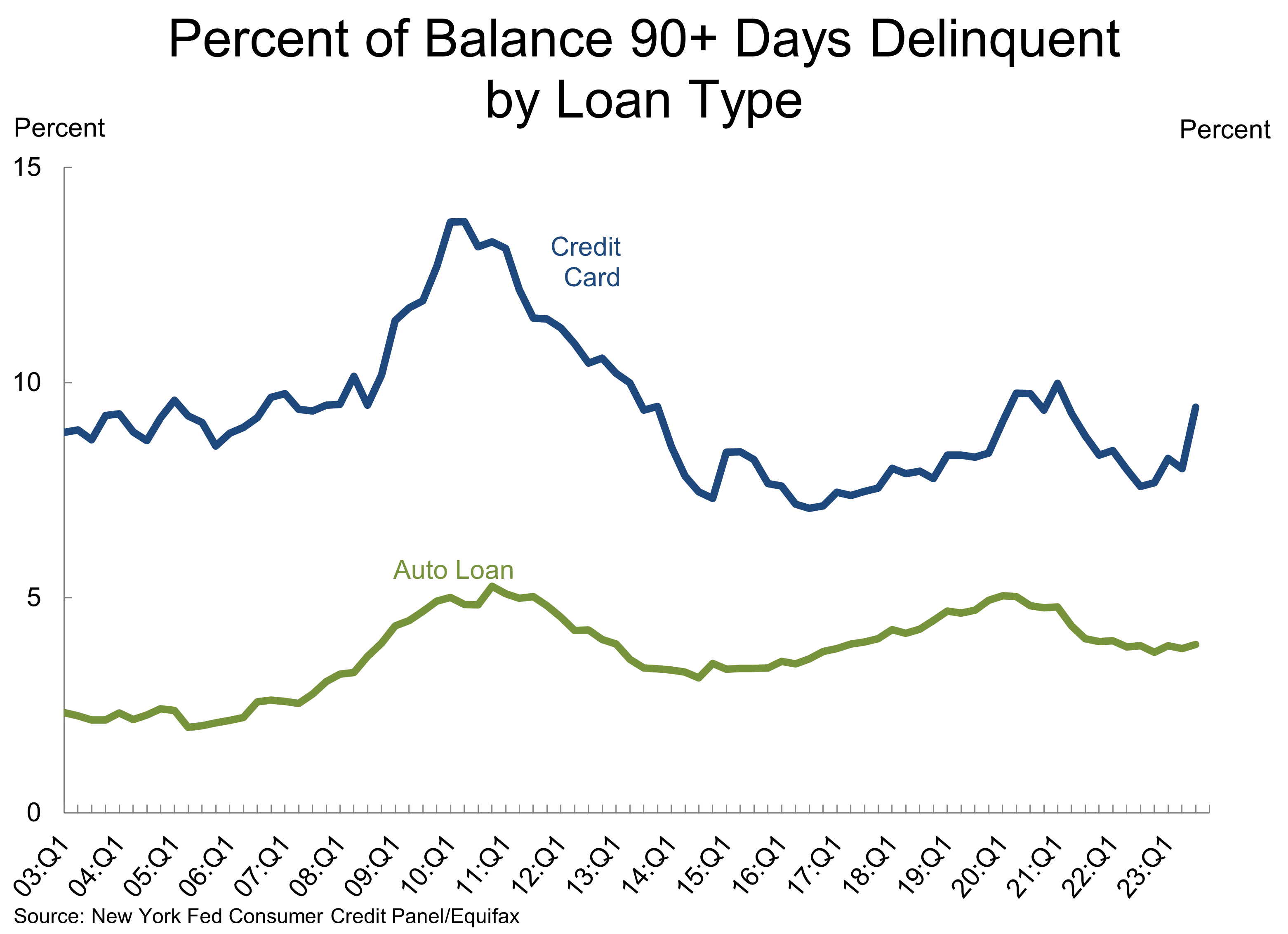
1. Serious delinquencies of auto loans and credit cards are still relatively low
The percent of auto loans and credit cards that are seriously delinquent, as a percent of the respective totals, remains relatively low. For auto loans, it’s at 3.9% versus 4.9% in Q4 2019 (pre-pandemic). It’s at 9.4% for credit cards versus 8.4% pre-pandemic.
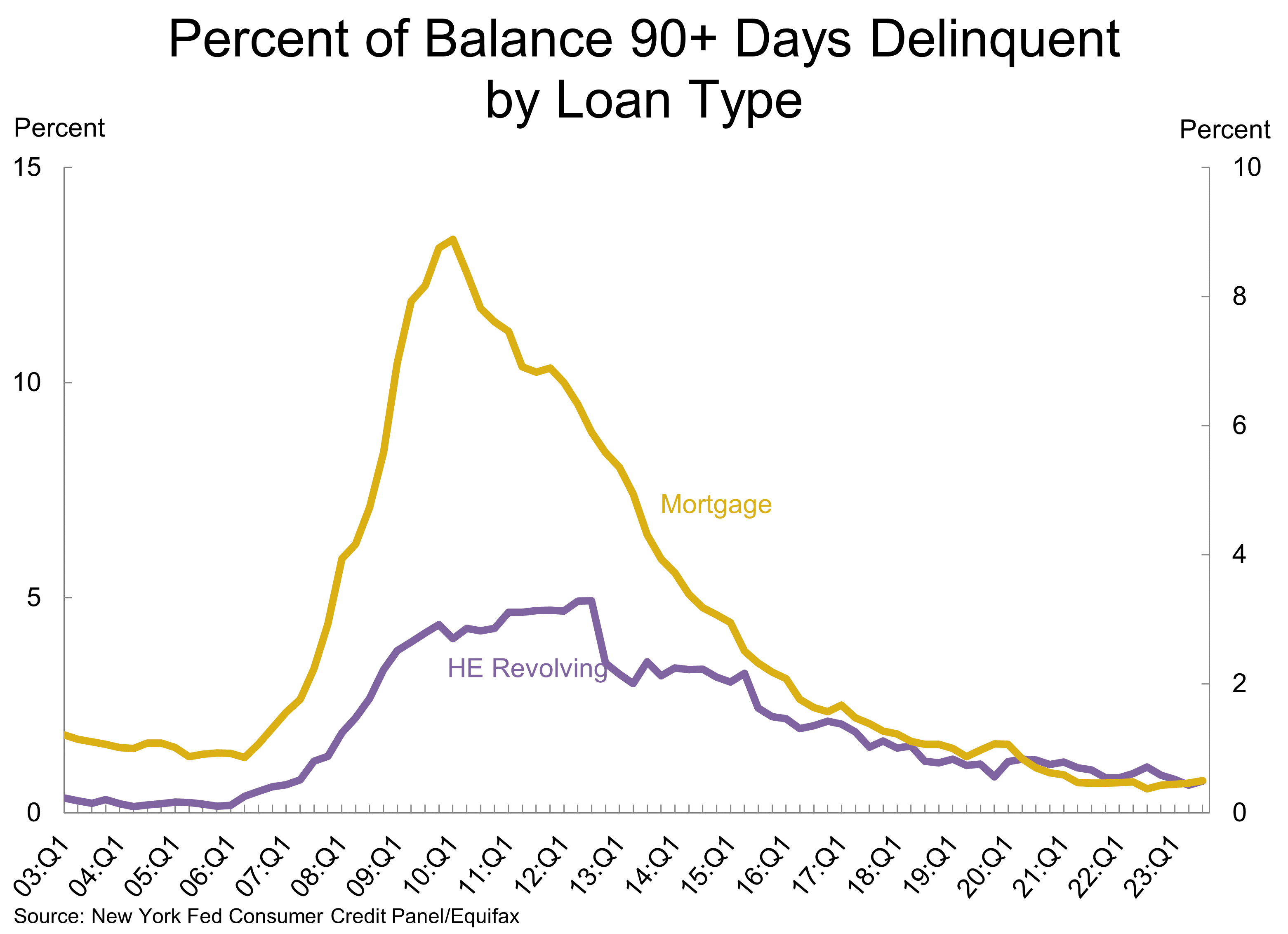
2. Mortgage debt is almost 5 times larger than credit cards and auto loans, and there’re no problems there
Auto loans and credit cards make up 9% and 6% of the $17 trillion of consumer debt, respectively. Mortgages make up 70% of consumer debt, while home equity loans make up another 2%. And right now, seriously delinquent balances on mortgages and home equity loans are running close to historical lows. Seriously delinquent balances on mortgages are just 0.5% of balances, versus 1.1% pre-pandemic. Home equity loans tend to be floating rate, and have seen rates surge over the last year, but even serious delinquencies there are at 0.7%, below the 0.8% we saw pre-pandemic.
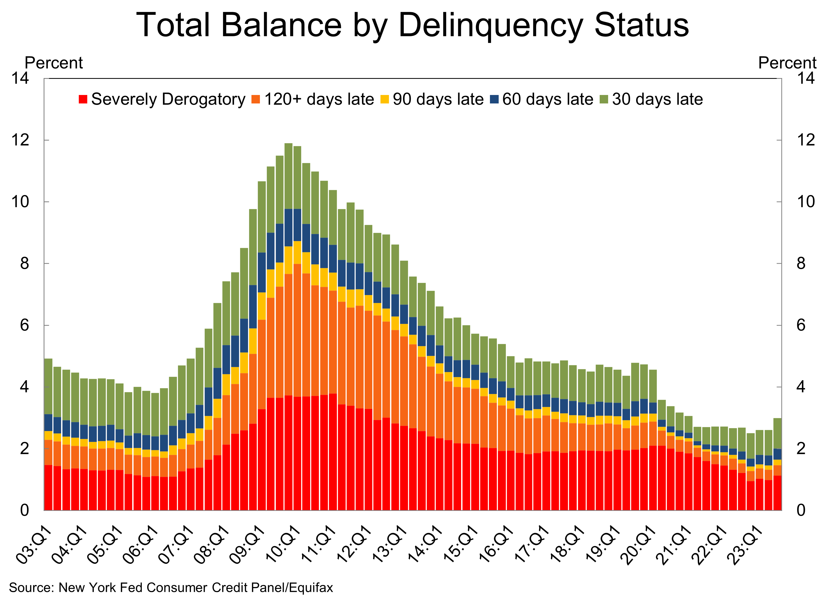
3. Overall delinquent balances are well below what we saw pre-pandemic
The percent of total debt balances that were current on payments is at 97%, versus 95.3% pre-pandemic. In other words, only 3% of total balances are delinquent, versus 4.7% pre-pandemic. What’s striking is how the most derogatory balances (120-days late + severely) is just 1.5% of total balances. That’s well below the 2.8% pace we saw pre-pandemic.
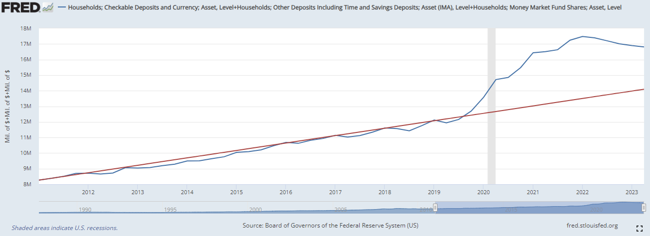
4. Households still have a lot of liquid cash and savings
There’s been a lot of chatter about excess savings being depleted. You can run the numbers a lot of different ways, but right now it’s probably close to $1 trillion. However, we don’t need to look at numbers that change based on different assumptions and can instead just look at the amount of money households have in checking, savings, and money market accounts. There’s about $17 trillion across all of these, which is a whopping $2.7 trillion more than what you’d have expected based on the pre-pandemic trend.
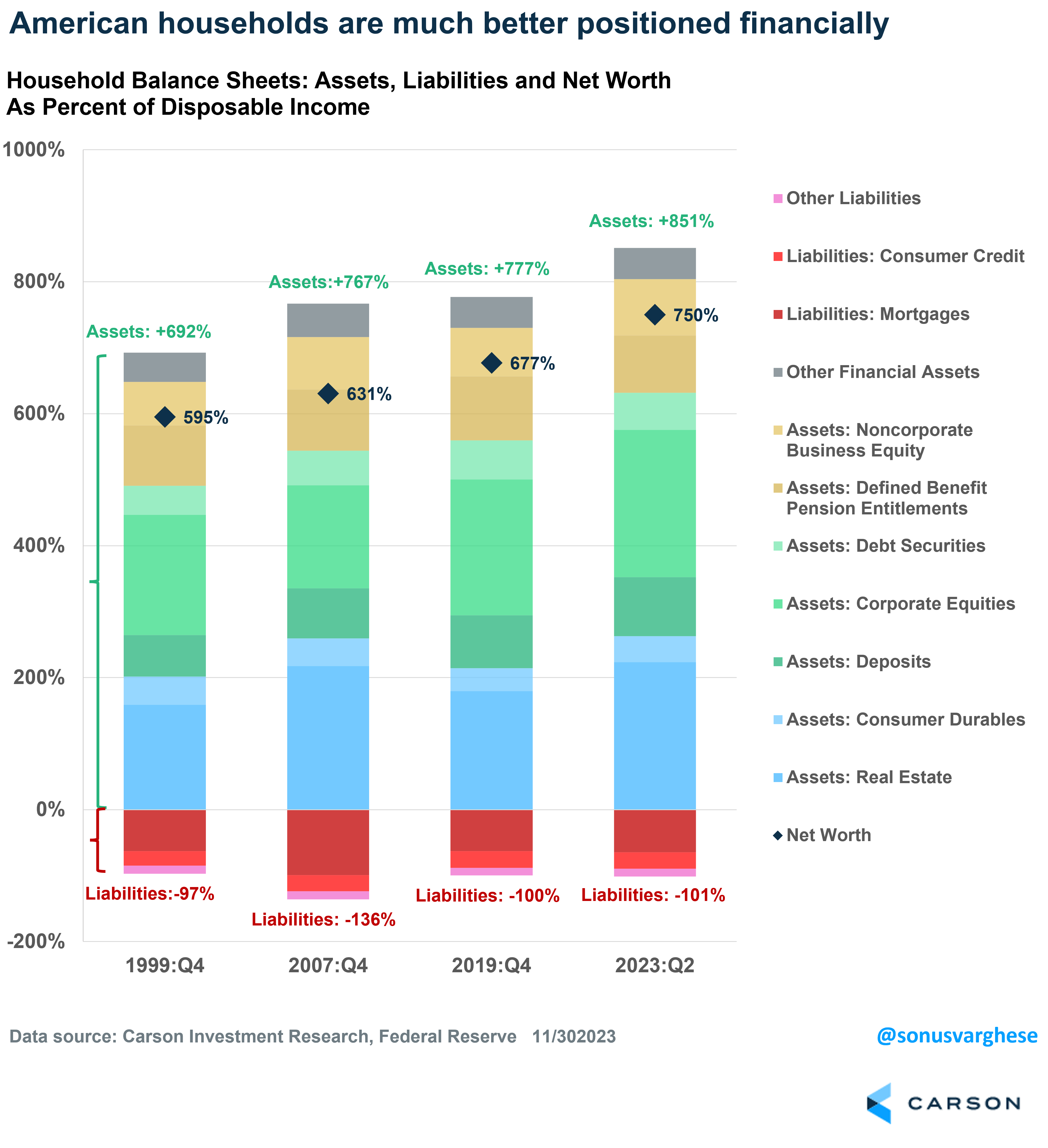
5. Households are much less leveraged now
The overall household sector balance sheet looks much better than at any time in recent history. Net worth is currently 750% of disposable income, versus 677% before the pandemic. A big reason is that asset prices, including stocks and real estate, have gone up over the last four years. At the same time, liabilities as a percent of disposable income have remained steady around 100%. That’s a lot less than what household liabilities looked like on the eve of the financial crisis.
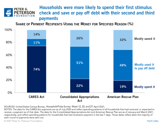
6. Stimulus checks were mostly used to reduce debt and increase savings
It’s a common belief that it was the stimulus checks that drove spending. That was actually true only for the first round of checks in the CARES Act, during the depths of the pandemic crisis in 2020. The second and third round of checks were mostly used to pay down debt or used to increase savings. Only about 20% of the second and third round of checks were used for spending. This is a big reason why households have a lot more savings and relatively stable debt despite high inflation.
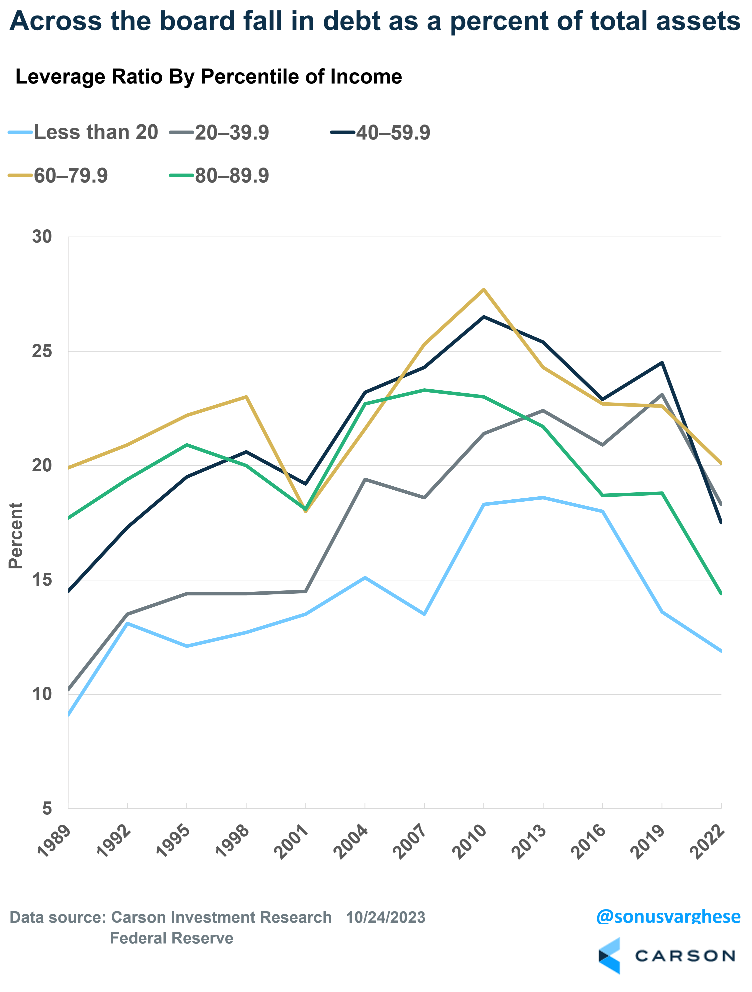
7. Debt as a percent of total assets has fallen across the income distribution
One valid knock against the above data is that most of the savings accrued to more wealthy households. However, the Fed’s recent Survey of Consumer Finances, which is considered the “gold standard” of data related to consumer finances, showed that the “leverage ratio” has fallen across all quintiles of income since the pandemic. The leverage ratio is debt as a percent of total assets. In fact, the drop in the leverage ratio is relatively larger for lower income households.
- Less than 20th percentile of income: 11.9% (13.6% in 2019)
- 20th – 40th percentile: 18.3% (23.1%)
- 40th to 60th percentile: 17.5% (24.5%)
- 60th to 80th percentile: 20.1% (22.6%)
- 80th to 90th percentile: 14.4% (18.8%)
- 90th to 100th percentile: 6.2% (7.0%)
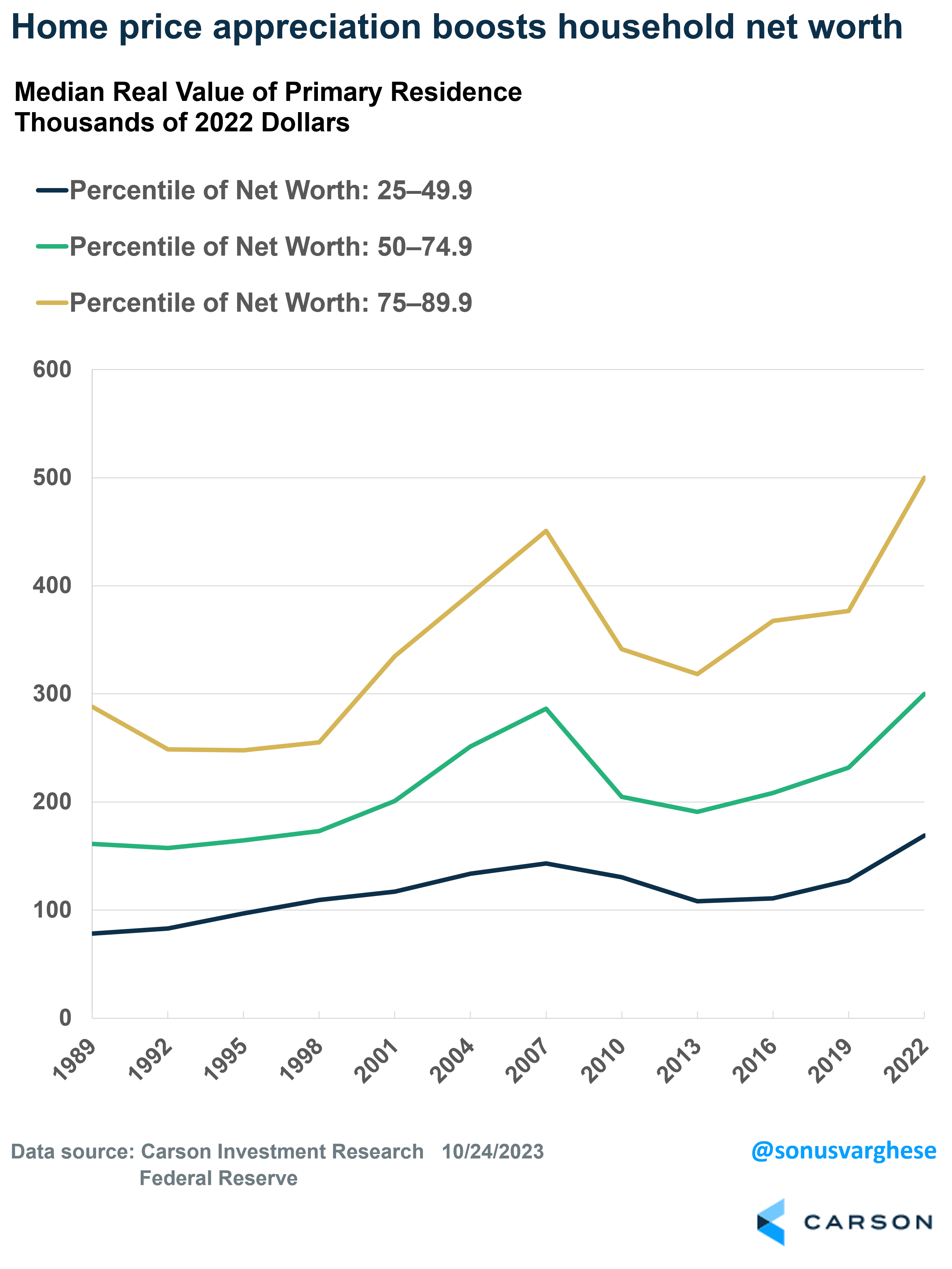
8. Home price appreciation is a big boost to household net worth across the wealth spectrum
An overwhelming majority of consumption is from the upper 80 percent of consumers by income. In 2022, less than 9% of aggregate spending was by consumers in the bottom 20th percentile of income.
Families above the 25th percentile of wealth not only reduced liabilities (as a percent of income), but their asset values have also surged over the last four years – thanks to surging stock prices and home prices. For families in the middle 20th-60th percentile of net worth especially, the home is the biggest asset and those prices have surged. While they may not want to sell immediately (to avoid taking on a higher mortgage), this is still a massive contrast to what we saw after the Financial Crisis. Back then, stock prices and home prices crashed but only stocks recovered fairly quickly. It took close to a decade for home prices to recover, and so households had to shore up their balance sheets. They did this by saving more, and so consumption was on the weaker side over the past decade.
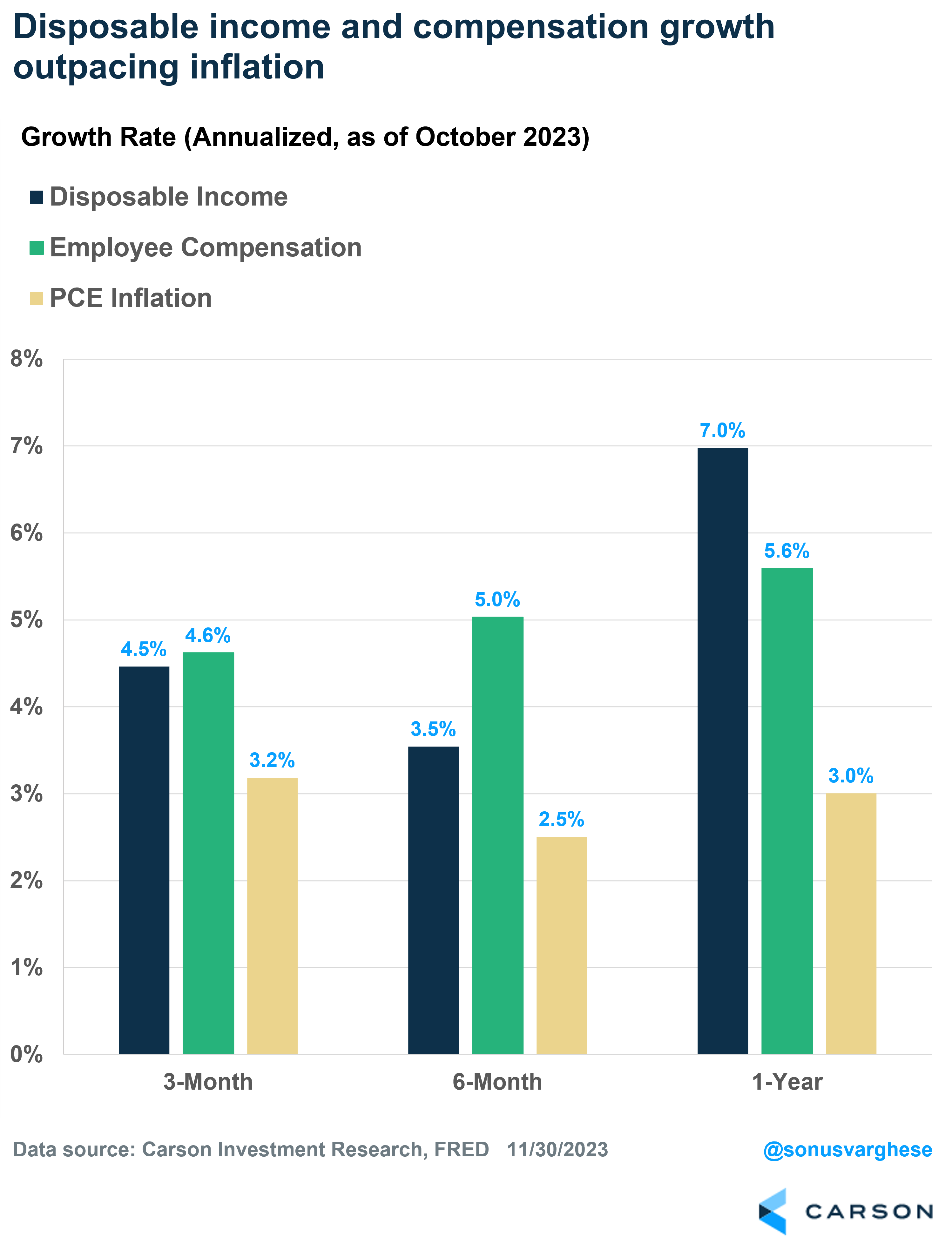
9. Disposable income and employee compensation growth are running ahead of inflation
As I pointed out above, stimulus checks haven’t driven spending since the first round of checks. Instead, spending has been driven by incomes. In 2022, as inflation surged, households saved less to maintain their level of spending. The fact that they were less leveraged helped, not to mention the fact that their net worth was higher.
The good news is that inflation is pulling back now, and both disposable income and overall employee compensation are running ahead inflation. This is why consumption continues to run above trend, even as the savings rate starts to creep higher.
10. The most important point is that the labor market remains strong
Ultimately, to keep a pulse on the consumer, nothing really beats labor market indicators. The labor market is the entire ballgame as far as the consumer is concerned. And if the labor market deteriorates, incomes fall, consumption falls, and the economy is in trouble.
The best indicator is probably the unemployment rate, which has increased from 3.4% to 3.9%. However, that may be because more people are coming into the labor force. Labor force expansion is not what you associate with a deteriorating economy. Ryan Detrick, Chief Market Strategist and I discussed all this with former Fed economist Claudia Sahm on a recent Facts vs Feelings episode. Seriously, if you’re concerned about the labor market, I recommend listening to it right away (link).
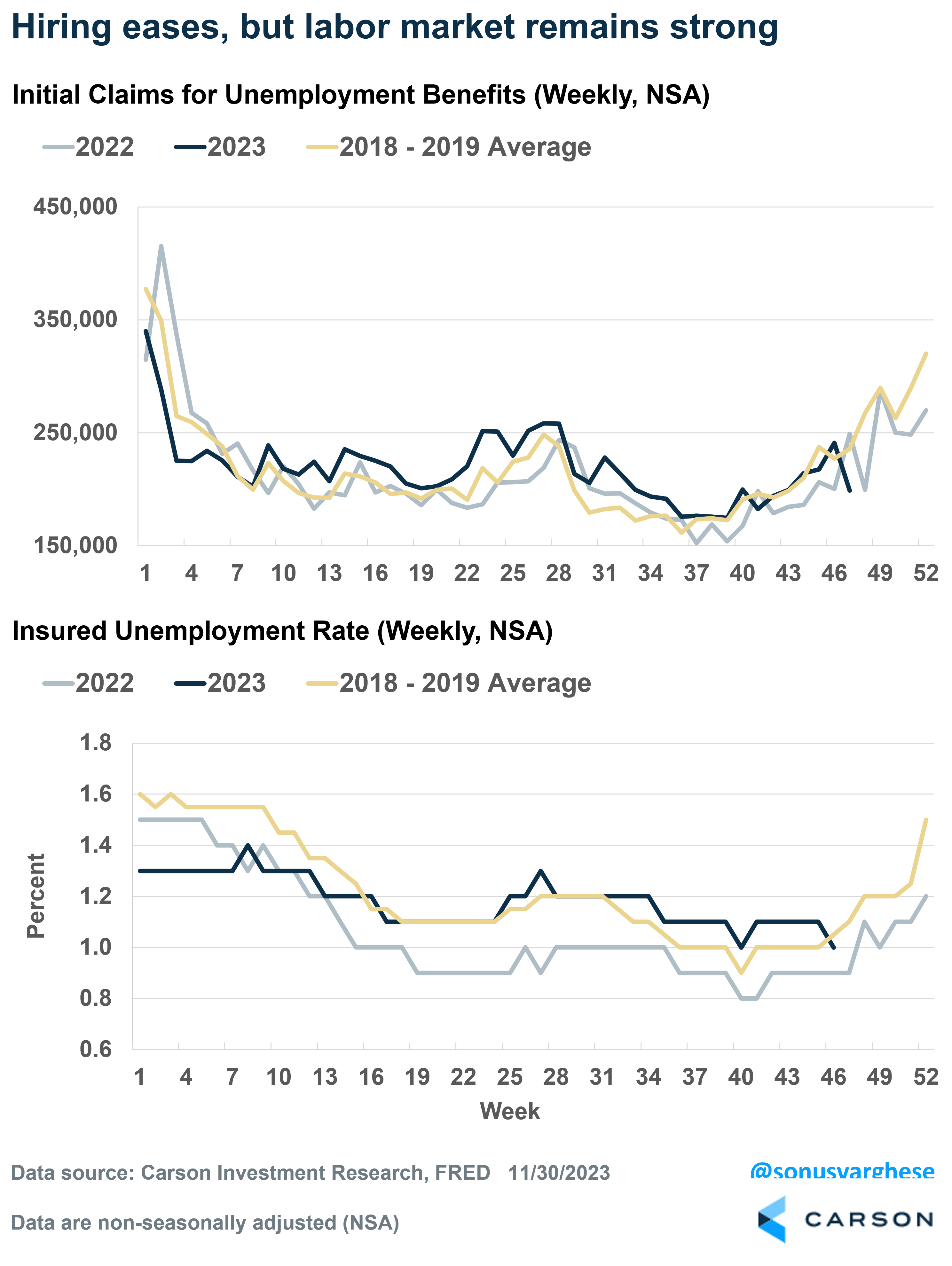
Historically, weekly unemployment claims have been a leading indicator for labor markets. Initial claims for benefits tell you whether layoffs are increasing, while continuing claims for benefits tell you how hard it is for laid off workers to find jobs.
Seasonal adjustments due to pandemic-related distortions have been a big problem with claims data lately. To get around this, I compare non-seasonally adjusted data for 2023 to corresponding weekly data in 2022 and the 2018-2019 average. The top panel in the chart below shows that initial claims continue to run low. They’re comparable to what we saw in 2022 and in 2018-2019, indicating companies are not laying off too many workers.
The bottom panel shows continuing claims for benefits normalized by the size of the labor force – this is the “insured unemployment rate.” You can see that it’s about 1% now, and slightly higher than in 2022, which means hiring has eased and workers are finding it a little harder to find jobs. Yet, it’s running close to where it was in 2018-2019, indicating that this is a still a strong labor market.
Ultimately, the labor market is what matters for the economy and right now, it’s looking healthy. That’s the big picture. Ryan and I keep a constant pulse on what’s happening in markets, the labor market, and other key segments of the economy, and we discuss this on Facts vs Feelings every week. Take a listen below.
2010919-1223-A