Investments

Charts of the Week: July 6-10
Thanks for reading this week’s Charts of the Week This week’s charts cover the job market, the consumer, Carson’s Proprietary LEI, and some of the biggest themes of the past couple of years and their changes. We’ll keep publishing Charts of the Week every Monday. To view this week’s Charts of the Week, click here: Charts …
Carson Research
July 13, 2026
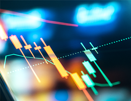
Technology Earnings Preview
Technology earnings season for the second quarter is fast approaching. Investors are facing the most divergent performance among sector constituents in recent history, with semiconductors having surged in performance while software continues to struggle. Capital expenditures and revenue growth are likely to be under scrutiny this earnings season as companies try to show they’re on …
Blake Anderson
July 13, 2026

Our Favorite Charts From the First Half of 2026
What a first half it’s been. We had a war, an oil spike, a 9% pullback, a furious rally, a bull market that keeps getting called old, and an AI trade that keeps getting even more interesting (and confusing). Altogether, 6 months felt like 6 years. So to mark the halfway point, the Carson Investment …
Harry McDonald
July 10, 2026

The AI Wave Is Everywhere, Even in Small Caps
You would think AI is a growth story, but it’s showing up in more places than in the obvious “large cap growth” stocks. In a recent blog I noted how even so called “value” stocks have seen returns driven by the AI wave. Looking at style box returns for the first half of the year, …
Sonu Varghese
July 8, 2026
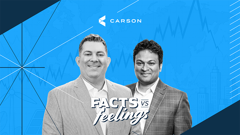
The Summer Rally Continues (FvF Ep. 195)
In Episode 195 of Facts vs Feelings, Ryan Detrick, Chief Market Strategist at Carson Group, and Sonu Varghese, Chief Macro Strategist at Carson Group, celebrate the Dow’s first close above 53,000 and break down the fastest 1,000-point milestone in the index’s history. They unpack what they see as really driving the S&P 500’s 10% first-half …
Ryan Detrick
July 8, 2026

More Reasons To Be Bullish the Rest of 2026
“Someone will always be getting richer faster than you. This is not a tragedy.” Charlie Munger Well, that’s a wrap on the first half of 2026. After all the hand wringing this spring over the Middle East, oil prices, and the Fed, the S&P 500 closed the first six months up a very solid 9.6% …
Ryan Detrick
July 7, 2026
Charts of the Week: June 29 – July 2
Thanks for reading this week’s Charts of the Week This week’s charts cover momentum, unemployment numbers, inflation, and the yield curve. We’ll keep publishing Charts of the Week every Monday. To view this week’s Charts of the Week, click here: Charts of the Week: June 29 – July 2
Carson Research
July 6, 2026
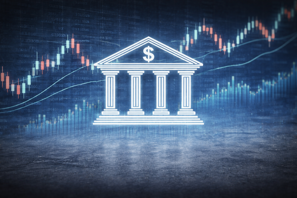
Bank Earnings Preview
Second-quarter bank earnings are around the corner, and expectations are perhaps correctly elevated across the board. Many of the larger firms in the sector may have just seen record-breaking quarters thanks to robust capital markets activities driven by equity issuances. And many of the smaller firms may be benefitting from robust lending and banking activity …
Blake Anderson
July 6, 2026

Focus on the Big Picture: The Labor Market Is OK & Households Are Spending
Every so often, the data throws a bit of a curveball at you, and that’s essentially what the June payroll report did. But that’s also a cue to take a step back and focus on the big picture. Right now, the big picture is that the labor market is in fine shape. That’s good for …
Sonu Varghese
July 2, 2026

Bond Observations from the First Half
As Barry wrote about yesterday, bonds have had a volatile year so far, and the payoff for the volatility we have seen is a barely positive return for the year for the aggregate bond market, including interest. Rates have moved higher across the yield curve, credit spreads have widened slightly, and bonds fell alongside equities …
Grant Engelbart
July 1, 2026
Stop, Drop, & Rotate (FvF Ep. 194)
In Episode 194 of Facts vs Feelings, Ryan Detrick, Chief Market Strategist at Carson Group, and Sonu Varghese, Chief Macro Strategist at Carson Group, take on the “June swoon” and the powerful market rotation shaking up underlying sector leadership. They analyze insights from Sonu’s time at the Economic Club of New York, covering Scott Bessent’s …
Ryan Detrick
July 1, 2026
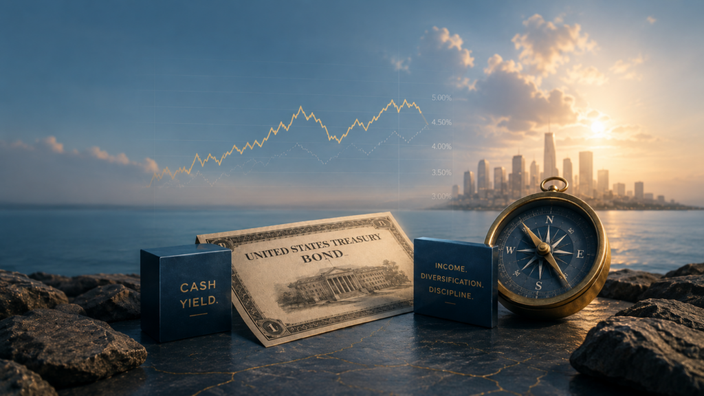
The Rate Regime Hasn’t Fundamentally Changed
Bonds have made a modest comeback lately as rates have retreated amid slow progress in negotiations with Iran and the start of some movement through the Strait of Hormuz. The 10-year Treasury yield peaked at 4.66% on May 19 and now sits at 4.37%, not far off from the median of 4.29% since the start …
Barry Gilbert
June 30, 2026